Letterforms
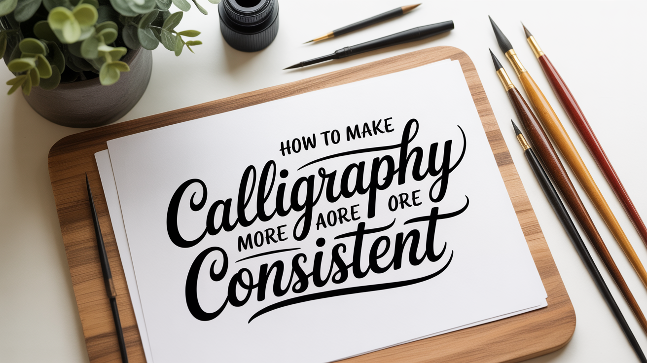
How to Make Your Calligraphy More Consistent
Learn why calligraphy looks uneven and get practical tips on slant, x-height, spacing, pen angle, and stroke weight to build consistent calligraphy.
Consistency is the quality that separates a polished piece from a shaky one, and it is almost always the last skill to arrive. If your letters look different from one line to the next, that is completely normal. Consistent calligraphy develops through repetition, not talent, and it helps to know exactly which variables you are trying to control before you drill them.
This guide breaks down the main levers: slant, x-height, spacing, stroke weight, pen angle, and speed. Work on one at a time instead of all at once.
Why Calligraphy Looks Inconsistent
Most inconsistency comes from letting several variables drift at the same time. Your hand is managing the tool, the pressure, the direction, and the speed simultaneously, and any of those can wander without you noticing.
Common reasons your calligraphy looks inconsistent:
- No guide sheet underneath. Writing freehand without guidelines removes the anchor that keeps x-height (the height of your lowercase letters, not counting ascenders or descenders) stable.
- Pen angle keeps shifting. The pen angle is the angle your nib or pen tip makes with the writing line. A small change alters how thick your strokes are.
- Speed varies between letters. Faster strokes tend to be thinner and lighter; slower strokes pick up more ink and press harder. Uneven speed creates uneven weight.
- Grip tension changes mid-word. Tightening or loosening your grip mid-letter changes the pressure on the downstroke (the stroke that travels toward you, which carries the thick weight in pointed-pen work).
Identifying which of these applies to you is the first step.
Control Your Slant
Slant is the angle your letters lean from vertical. A consistent slant makes a page look unified even when other things are slightly off.
How to practice it:
- Rule a set of parallel diagonal lines across your practice paper at your chosen slant angle. 55 degrees from horizontal is a common starting point for Copperplate; upright scripts sit closer to 90 degrees.
- Write a single letter and check that its main stem aligns with the ruled lines.
- Write a full word, then hold the page at arm's length. If one letter leans differently from the others, circle it and repeat that letter in isolation.
- Slow down on curves. Ovals and round letters are where slant drifts most because the hand is moving in an arc rather than along a straight line.
You do not need to aim for a mathematically perfect angle. Pick one angle and repeat it.
Lock In Your X-Height
X-height is the height of your lowercase letters from the baseline (the line they sit on) to the top of letters like a, e, o, and n. When x-height varies, words look lumpy even if the letterforms themselves are correct.
The fix is simple: always use guidelines. A guide sheet placed under semi-transparent practice paper gives you a baseline and a waistline (the top boundary of the x-height zone) to work between.
Practice tactic: Before writing any word, write a row of the letter n from left to right. Every n should touch the baseline and reach the waistline. If they vary, adjust your movement rather than your paper before moving on to full words.
Refer to the basic strokes that build every letter for a primer on the compound curve that underpins letters like n, m, and u, since mastering that stroke directly stabilizes x-height.
Even Out Your Spacing
Spacing is the distance between letters (inter-letter spacing) and between words. Uneven spacing is often what makes beginners think their letterforms are wrong when the letters themselves are actually fine.
The goal is optical consistency, not mechanical consistency. The space between two round letters (o and c together) needs to be slightly smaller in measurement than the space between a straight letter and a round one (n followed by o) in order to look the same to the eye.
A practical rule to start: After writing each letter, pause and ask whether the white space inside that letter roughly matches the white space between it and the next letter. If your letters have open counters (the enclosed or partly enclosed space inside letters like o, a, and d), the gaps between letters should feel similar in area.
You can also trace over finished calligraphy that you admire, focusing only on the white spaces between strokes. Your eye will calibrate to what "even" actually looks like.
Manage Stroke Weight and Pen Angle
In pointed-pen calligraphy, thick strokes are produced by pressing the tines of the nib apart on downstrokes, while upstrokes (strokes moving away from you) are made with light, minimal pressure so the nib glides as a fine line. The contrast between these two is what gives scripts like Copperplate their look.
For brush pens, the same principle applies: press on down, lift on up.
Inconsistent weight usually means one of two things:
- You are pressing on upstrokes. This is the most common beginner error. Practice slow, separate upstrokes with almost no pressure until the motion becomes automatic.
- Your pen angle is drifting. Hold the pen at the same angle to the writing line for every letter. A pen tilted to the left produces a different thick-to-thin pattern than one held more upright.
Drill: Write a page of alternating upstrokes and downstrokes with nothing between them, like a ladder of ovals. Check that every upstroke is the thinnest line your nib will make and every downstroke is the thickest.
See the lowercase calligraphy alphabet for beginners for how these strokes combine into full letters.
Regulate Your Speed
Speed is the variable that most beginners overlook. Fast writing and slow writing from the same pen look different because pressure builds and releases at different rates.
Aim for a pace that feels slightly slower than natural. You should have time to feel the nib or brush tip respond to each change in direction.
Signs your speed is inconsistent:
| What you see | Likely cause |
|---|---|
| Some letters look spidery, others blotted | Speed varies between letters |
| Thick strokes start thin and then fill out | You are accelerating into downstrokes |
| Curves have a flat spot at the top or bottom | You are slowing down at direction changes only |
| Lines of practice look uneven across a page | You speed up as your hand warms up |
Pick a pace at the start of a session and try to hold it through the entire page. If you notice the pace changing, stop, reset, and begin a new row.
A Simple Self-Check Routine
After finishing a practice page, run through these four questions before starting the next one:
- Slant -- Do all the stems point the same direction? Lay a ruler alongside a few letters to check.
- X-height -- Are the tops of your lowercase letters level with each other? A straightedge along the waistline will show any outliers quickly.
- Spacing -- Does any letter look crowded against its neighbor, or isolated from the rest? Mark any problem pairs and repeat them as a two-letter combination.
- Weight -- Are the thick strokes roughly the same thickness across the page? Hold the paper at arm's length to judge this.
One question per session is enough if all four feel overwhelming.
For an overview of how these letterform principles apply to capitals, see calligraphy capital letters for beginners.
Frequently Asked Questions
How long does it take for calligraphy to become consistent?
Most beginners notice meaningful improvement in slant and x-height within four to six weeks of regular practice, roughly three to four sessions per week. Spacing and weight take longer because they depend on muscle memory built across many repetitions. Consistency is genuinely the slowest calligraphy skill to develop. That is true for everyone, not just beginners.
Should I practice drills or full words?
Both. Drills (repetitive strokes like ovals and compound curves) isolate a single movement so you can build the muscle memory for it cleanly. Full words show you how the transitions between letters behave. A good session includes some of each. Start with a few minutes of stroke drills, then move into words and short phrases.
Why do my letters look fine individually but uneven in a word?
This is a spacing problem more often than a letterform problem. Individual letters are judged against the guide sheet; words are judged against each other. Slow down when writing words and pause briefly between each letter to check the gap before committing.
My calligraphy looks consistent while I practice but falls apart when I write something real. Why?
Practice sessions usually happen slowly and with full attention on the mechanics. Real writing speeds up because you are thinking about the content. Try to replicate your practice pace when writing actual pieces. Some calligraphers write a few warm-up rows of drills immediately before starting a finished piece.
Does paper affect consistency?
Yes. Rough or highly textured paper catches the nib and breaks the rhythm of your strokes. Very smooth paper (like marker paper or HP premium laser paper) lets the nib glide and makes consistency easier to achieve. If your strokes look shaky even after practicing, try a smoother paper and check whether the problem persists.