Letterforms
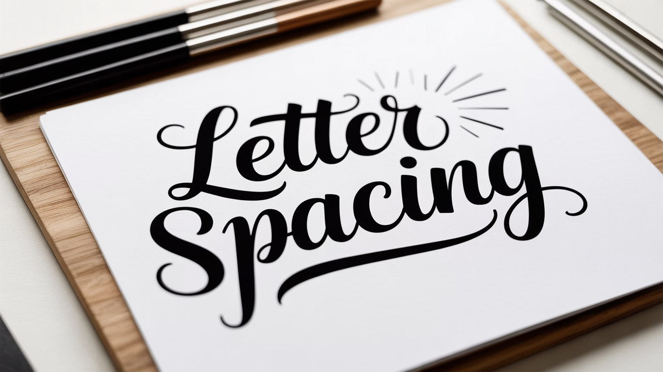
Letter and Word Spacing in Calligraphy and Lettering
Learn how to space letters and words in calligraphy. Practical guidance on optical spacing, common spacing mistakes, and a quick troubleshooting table.
Spacing is the part of calligraphy that beginners rarely think about until something looks "off" but they can't say why. The letters look fine on their own, yet the word feels cramped in one spot and loose in another. Almost always, the culprit is spacing.
Good letter spacing calligraphy is not about measuring equal distances between letters. It's about making the white space between letters feel consistent to the eye, which requires a different approach altogether.
Why Equal Gaps Do Not Work
Your eye does not measure distances in pixels. It reads the total area of white space enclosed between two shapes. A gap that looks right between two curved letters (like o and c) will look far too wide between two vertical letters (like n and i), even if a ruler says the gaps are identical.
This is why spacing in calligraphy is done optically, not mechanically. You adjust the gap until the white area looks balanced, not until the ruler reads the same number.
Three broad categories of letter pairs behave differently:
- Two verticals (n-m, h-i, l-l): need the smallest physical gap, because the open sides face each other and create very little enclosed space.
- One vertical, one curved (n-o, h-a, l-e): need a slightly wider physical gap, because the curve reduces the enclosed white area on one side.
- Two curves (o-c, a-o, d-e): need the widest physical gap, because both curves eat into the space from both sides.
A common way to practice this is the "n-o-n" exercise: write the letter n, then leave the gap you want, then write o, then adjust the next gap until the white inside the o looks similar in area to the white between the two letters, then write another n. This trains your eye before you ever move to full words.
How to Space Letters in Calligraphy: A Step-by-Step Approach
Learning how to space letters calligraphy beginners find manageable comes down to slowing down and looking between the letters, not at them.
- Write your word at a comfortable pace without thinking about spacing yet. This gives you a baseline to evaluate.
- Step back or hold the paper at arm's length. Problem spots become obvious at a distance.
- Find the tightest pair. The most cramped two letters are your reference point. Every other pair should match that density of white space, not exceed it.
- Identify the loosest pair and ask whether it genuinely matches the rest or whether the gap is too large.
- On your next attempt, adjust only the problem pairs. Do not try to fix everything at once.
- Check the counters. A counter is the enclosed or partially enclosed space inside a letter, such as the bowl of an a, the loop of a g, or the arch inside an n. The white space between letters should feel visually similar in weight to those counters. If the counters look heavy and the spacing looks airy, the spacing is too wide.
Repeat this process on a few practice sheets before moving to a finished piece. The habit of looking between letters, not just at them, takes time to build but becomes automatic.
Word Spacing in Lettering
Word spacing lettering follows similar optical logic. A common starting point is to leave a gap roughly equal to the width of a lowercase o in whatever script you are using. That is a starting point, not a rule.
In practice:
- Scripts with tall, wide x-heights (the x-height is the height of a lowercase letter without ascenders or descenders, such as x, a, or n) tend to need more word spacing so the gaps between words read clearly.
- Scripts with narrow proportions or strong contrast between thick and thin strokes often look best with slightly tighter word spacing, because the letterforms themselves already have a lot of visual rhythm.
- When writing a full sentence across a line, aim for the word gaps to be noticeably wider than the letter gaps but not so wide that the line breaks into isolated chunks.
A useful check: blur your eyes or view the line through a camera at a distance. The words should read as distinct groups, and the spacing between words should feel consistent down the line.
Spacing Troubleshooting Table
| Problem | Likely Cause | Fix |
|---|---|---|
| Word looks cramped overall | Letter spacing too tight throughout | Widen gaps, focus on vertical-vertical pairs first |
| One pair looks loose, rest looks fine | Curve-curve pair given same gap as vertical pair | Tighten just that pair to match surrounding white area |
| Word looks choppy or broken | Word spacing too wide | Reduce word gaps to roughly one lowercase-o width |
| Spacing looks fine close up, odd at a distance | Inconsistent rhythm | Step back after every word and compare white areas |
| Capitals look detached from the following letter | Too much space after a capital | Most capitals have a built-in wide right side; reduce the gap after them |
| Spacing looks right on paper, wrong in a photo | Optical distortion from shooting angle | Photograph straight-on at the same height as the paper |
Spacing for Pointed Pen vs. Brush Pen
The tools behave differently, and spacing adjusts with them.
Pointed pen scripts (Copperplate, Spencerian) have strong contrast between thin upstrokes and thick downstrokes. The upstrokes are almost invisible at a glance, so visual rhythm is carried by the thick strokes. Space so that the thick strokes feel evenly distributed across the word. If you see two thick strokes very close together and then a gap before the next cluster, your spacing is uneven even if the letter gaps themselves look consistent.
Brush pen lettering tends to have wider letterforms and more visual weight overall. Because the letters take up more horizontal space, the tendency is to rush and leave too little room between them. Slow down and give brush lettering a slightly more generous gap than you think it needs.
If you are still building your basic strokes, spacing will feel harder than it needs to be, because inconsistent stroke widths make it difficult to judge white areas accurately. Drilling strokes first makes spacing practice much more productive.
Spacing Within an Alphabet
Spacing is easiest to learn when you practice full alphabets rather than random words, because you encounter every letter combination systematically. When you work through the lowercase calligraphy alphabet, try writing sets of three letters at a time: the target letter sandwiched between two n shapes. The n is a reliable neutral letter that lets you isolate how each new letter interacts with its neighbors.
For capitals, the same logic applies. Run through the calligraphy capital letters paired with a lowercase a on the right, and evaluate whether the space after the capital looks consistent across the whole alphabet. Capitals with diagonal strokes (A, V, W) almost always need the gap after them reduced.
Frequently Asked Questions
How much space should I leave between letters in calligraphy?
There is no fixed measurement. Spacing in calligraphy is optical: you adjust the gap until the white space between letters matches the visual weight of the white space inside the letters (the counters). As a rough starting point, two curved letters can touch almost as closely as two vertical letters, but the physical gap between them will be wider.
Why does my calligraphy spacing look fine when I write but wrong when I photograph it?
Photographs flatten contrast and sometimes shift proportions if the camera angle is not straight-on. Shoot directly above the paper with the lens parallel to the surface. Also, our eyes are forgiving in real time; the camera is not. A second issue is that ink looks darker and denser in photos, which makes tight spacing look even tighter.
Does word spacing in lettering change when I write larger?
Yes. At larger sizes, the eye is more sensitive to gaps, so word spacing tends to need a slight increase to prevent words from running together visually. Scale the word gap proportionally: keep it close to one lowercase-o width at whatever size you are writing.
My spacing improves on warm-up sheets but falls apart on the final piece. What is happening?
Anxiety about the final piece causes most people to grip tighter and speed up slightly. Both change the natural rhythm of letterforms. Try warming up for longer before the final piece, and practice the specific word or phrase you plan to write at least five times on practice paper before committing to the good sheet.
Is there a difference between letter spacing and tracking?
In typography, tracking refers to adjusting space uniformly across all letters in a block of text. In hand lettering, you are always spacing optically pair by pair, which is closer to what typographers call kerning. The term "letter spacing" is the most common term in calligraphy contexts and covers both ideas.