Getting Started
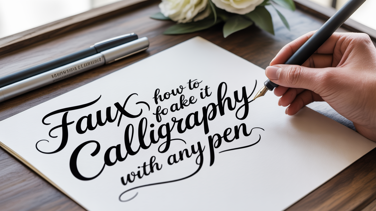
Faux Calligraphy: How to Fake It With Any Pen
Learn how to do faux calligraphy with any pen you own. A step-by-step beginner's guide to fake calligraphy that looks like the real thing.
Real calligraphy uses a flexible nib (the metal writing tip) that spreads apart when you press down, making thick strokes on the way down and thin strokes on the way up. It takes specialized tools, a fair bit of practice, and a willingness to deal with ink. Faux calligraphy, sometimes called fake calligraphy, gets you the same thick-thin look using any pen you already own. A ballpoint, a felt-tip, a gel pen: all of them work. You just draw the thick parts in rather than pressing them out.
If you have ever seen gorgeous hand-lettered envelopes and thought "I could never do that," faux calligraphy is where to start. It is slower than the real thing, but it is also far more forgiving. Beginners can produce results they are proud of in a single afternoon session.
What Faux Calligraphy Actually Is
Traditional pointed-pen calligraphy relies on a tool with a split tip, those two metal prongs are called tines. Press gently and the tines stay together, making a hairline stroke. Press harder on a downstroke (a stroke moving toward you, from top to bottom) and the tines spread, depositing more ink and making a thick stroke. The variation between thick and thin is what gives calligraphy its characteristic look.
Faux calligraphy mimics this by hand. You write a letter in your normal cursive or in a basic script style, then identify every downstroke and add a second parallel line beside it. Fill in the gap between the two lines, and you have thick strokes and thin strokes, just like the real thing, drawn rather than pressed.
No special tools. No flex nib. No learning curve around ink flow. The tradeoff is time: a faux calligraphy piece takes longer to complete than a piece written with a proper flex nib once you are practiced with both. But at the start, faux calligraphy is the faster, easier path to a great-looking result.
What You Need
Almost nothing. Here is a basic checklist:
| Item | What to look for |
|---|---|
| Pen or marker | Consistent ink flow; avoid pens that skip |
| Paper | Smooth enough that the pen glides without catching |
| Pencil | For lightly sketching letterforms first (optional but helpful) |
| Eraser | A soft vinyl type won't smear dried ink |
For a first session, a medium-point felt-tip marker or a fine-liner works well. The tip should be firm, a brush-tip pen is great for real brush calligraphy but tends to squash unpredictably for this technique. Smooth printer paper or a cheap notepad is fine. You do not need calligraphy paper, fountain pen paper, or anything with a grid until you are ready to work on consistency.
Once you are comfortable with the technique, you can move to better paper and finer pens. A smooth, coated paper will show cleaner edges on the filled-in strokes. A fine-liner pen gives you thinner hairlines, which look more elegant. But none of that matters on day one, just pick up whatever is within reach.
How to Do Faux Calligraphy: Step by Step
Work through this sequence slowly the first few times. Speed comes naturally once your eye learns to spot the downstrokes.
-
Write a word in cursive or a simple connected script. Leave a little extra space between letters so you have room to thicken the strokes without letters merging together. Your writing doesn't have to be elegant at this stage, legibility is enough.
-
Identify every downstroke. A downstroke is any part of a letter where your pen moved downward (toward the bottom of the page). In the letter "n," for example, both vertical strokes are downstrokes. In a cursive "a," the left side of the oval and the final descending stroke are downstrokes. Trace over the letter with your eye and mentally flag these spots.
-
Draw a second line parallel to each downstroke. This line should run alongside the original stroke, creating a narrow channel. The gap between the two lines becomes your thick stroke. Keep the parallel line close, about 1 to 3 millimeters away depending on the pen size and how bold you want the result to look.
-
Fill in the channel between the two lines. Use your pen to color in the gap solidly. Work in small strokes rather than trying to drag across a wide space in one sweep; this keeps the edges cleaner.
-
Let the ink dry before you erase any pencil sketch lines. Smearing wet ink is easy to do and hard to fix.
-
Step back and look at the whole word. Check that every downstroke is thick and every upstroke (strokes moving upward or horizontally) stays thin. Fix any spots you missed.
That's the complete technique. The rest is practice and refinement.
Common Mistakes (and How to Avoid Them)
Beginners almost always run into the same handful of problems. None of them are permanent.
Thickening upstrokes by accident. This is the most common error. Upstrokes should always stay thin, only downstrokes get the second line. When you are starting out, go letter by letter and pause after writing each one to add the thick lines before moving on. Doing the whole word first and then going back to add thickness makes it easier to lose track of which strokes go which direction.
Lines that waver on the fill-in pass. Shaky edges on the filled channel look messy. Two fixes: use a pen with a fine tip for the outline lines, even if you use a slightly broader one for filling; and slow down. There is no benefit to rushing this step.
Letters merging into a blob. If your original cursive letters sit too close together, adding thickness causes them to bleed into each other. Write a little more openly than feels natural until the spacing starts to feel instinctive.
The thick strokes look uneven across the word. This usually means the parallel lines aren't staying a consistent distance from the original stroke. A light pencil guideline, just a faint second scratch next to each downstroke before you ink, can help you keep things uniform. Erase it once the ink is dry.
Early results will not look polished. That is normal, not a sign that faux calligraphy isn't for you. The eye-hand coordination needed to spot and thicken downstrokes consistently takes a few sessions to click. A beginner's daily calligraphy practice routine can help you build that habit without burning out.
Building on the Technique
Once you can do clean faux calligraphy in cursive, a few variations open up.
Print lettering with faux calligraphy. You don't need cursive. You can write in simple block or print letters and apply the same downstroke rule. Print faux calligraphy tends to look more geometric and bold; it works well for signs, headers, and short phrases.
Mixing with color. Try writing the thin hairlines in one color and filling the thick downstrokes in a contrasting color. This is simple to do and adds a lot of visual interest to greeting cards or journal pages.
Adding flourishes. A flourish is a decorative curved extension on a letter, usually on an ascender (the tall part of letters like "h," "l," or "k") or a descender (the tail on "g," "p," or "y"). You can sketch a flourish in pencil first, then trace and thicken its own downstroke sections just like any other letter. This is easier to control in faux calligraphy than in real pointed-pen work, since you can erase and re-sketch freely.
Trying different pen widths. A fine-liner (0.3–0.5 mm) gives delicate hairlines and a precise look. A broader felt-tip (1–2 mm) gives a bolder, more casual style. Trying a few different tools is a quick way to see how much the pen choice changes the character of the lettering.
When you feel ready to try actual flexible-nib calligraphy, understanding calligraphy vs. hand lettering and what the difference is will help you know exactly what skill you are picking up next. The muscle memory you build doing faux calligraphy, knowing instinctively where the thick strokes go, transfers directly.
Practicing Effectively
Faux calligraphy rewards short, focused sessions more than long unfocused ones. Fifteen minutes of deliberate practice, where you pay close attention to stroke direction and line consistency, does more than an hour of copying words without thinking about what you are doing.
A few things worth practicing deliberately:
- Single letters in isolation. Pick one letter and write it ten times, adding the thick strokes carefully each time. Letters with lots of curves (a, g, o, s) are good ones to drill.
- Pairs of letters. Some letter combinations create awkward spacing. Practice the pairs that give you trouble, like "ry," "va," or "ow."
- Words that use all your problem letters. Write a short pangram or a phrase you want to use in a project. Real context helps you see how the letters interact.
Consistent practice also helps with one thing beginners often underestimate: knowing how to hold a calligraphy pen for proper grip and posture matters even for faux work. A tight, cramped grip causes your lines to waver and your hand to tire quickly. A relaxed grip, with the pen at a comfortable angle and your elbow resting on the table, lets you draw smoother lines for longer.
Frequently Asked Questions
Do I need special paper for faux calligraphy?
Not at the start. Smooth printer paper works fine for practice. If you are using a felt-tip marker and notice that the ink bleeds or feathers (spreads into small fibers), switching to a denser, smoother paper will help. Look for paper described as "marker paper" or a higher gsm (grams per square meter) weight. Avoid textured or recycled-fiber papers when you want clean edges.
Can I use a brush pen for faux calligraphy?
You can, though it works differently than a firm-tipped pen. A brush pen's tip compresses and springs back, so it naturally makes some variation in line width on its own. If you use a brush pen for faux calligraphy, write with the lightest possible pressure so all your strokes stay thin, then go back and add the thick lines the same way you would with any other pen. It is doable but adds a layer of complexity that is easier to skip while you are still learning.
Is faux calligraphy the same as hand lettering?
They overlap but aren't identical. Hand lettering is a broad term for drawing letterforms by hand, often building each letter with multiple strokes rather than writing it as a continuous movement. Faux calligraphy is one technique within hand lettering. Real calligraphy, by contrast, is a writing practice, letters are formed in a single continuous stroke with a tool that varies line width automatically. Faux calligraphy sits in between: it uses the writing motion of calligraphy but applies hand-lettering's "draw it in" approach to the thick strokes.
How long does it take to get good at faux calligraphy?
Most beginners can produce recognizable, tidy faux calligraphy within two or three practice sessions. "Good" is relative, of course. Clean, consistent faux calligraphy that looks intentional rather than labored typically takes a few weeks of regular short practice sessions. The thing that improves fastest with practice is spotting downstrokes automatically, early on, you have to think about each stroke consciously; later, it becomes second nature.
Can faux calligraphy help me learn real calligraphy?
Yes, in one specific way: it builds your understanding of the thick-thin stroke logic. When you move to a pointed pen (the nib-and-holder style of calligraphy), you already know which strokes need to be thick and which stay thin. That knowledge doesn't transfer the physical skills of controlling ink flow or nib pressure, but it means one less thing to learn at once. Many people who start with faux calligraphy find the transition to real calligraphy less overwhelming because the visual grammar is already familiar.