Tools & Supplies
Calligraphy Inks Explained: Which to Use as a Beginner
Learn the main types of calligraphy ink for beginners, from India ink to iron gall, and find out which to try first.
The question beginners ask most often after picking up their first pen is not about nibs or paper, it is about ink. And that makes sense. Pour the wrong liquid into a dip pen and it either refuses to flow, clogs the nib, or bleeds into the paper like a wet stamp. Choose wisely and the ink glides, the lines sharpen, and the whole experience clicks.
This guide covers the main types of calligraphy ink, what makes each one useful or tricky for beginners, and a simple starting point so you do not have to guess.
What Makes an Ink "Calligraphy Ink"?
Not every ink sold in a bottle works well with a dip pen or a brush. A good calligraphy ink needs three things: the right viscosity (thickness), consistent flow through a fine metal nib, and enough pigment or dye to produce a clear, readable line.
Fountain pen ink, for example, is usually too thin. It flows fast enough for a fountain pen's internal feed system but it spreads and feathers (bleeds outward along paper fibers) when loaded onto an open dip nib. At the other extreme, some screen-printing inks are so thick they never flow at all. Calligraphy inks sit in a workable middle range.
A few other terms worth knowing before we dig in:
- Pigment-based ink contains suspended solid particles that sit on top of the paper. It tends to be more lightfast (resistant to fading) and waterproof when dry.
- Dye-based ink uses dissolved colorants that absorb into the paper. It usually flows more easily but fades faster in sunlight.
- Lightfast means the ink color holds up under light exposure over time, relevant if you are making work you want to last.
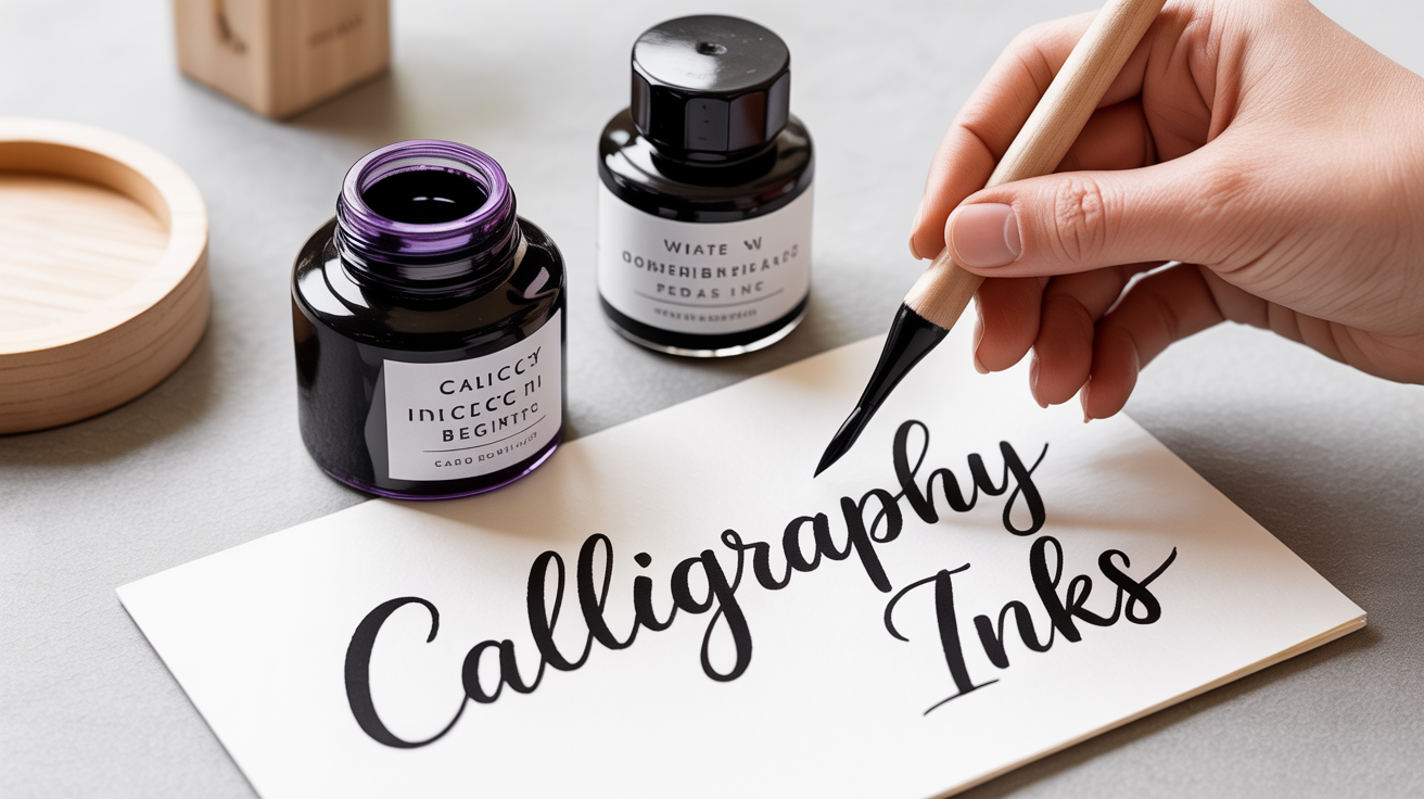
India Ink: The Standard Starting Point
India ink (also called Indian ink) is the ink most calligraphy teachers point to first. It is a carbon-black, pigment-based ink that has been used for centuries. The carbon pigment is suspended in water with a binder, often shellac or a similar resin.
Why it works well for beginners:
- It is widely available in art supply stores and online.
- The black is dense and opaque, so letters read crisply.
- It dries waterproof, which lets you paint over it without smearing.
- The viscosity suits most dip nibs out of the box.
What to watch for: Shellac-based India inks dry hard and fast. Left on a nib for more than 20 or 30 minutes, the dried ink can gum up the tines (the two flexible prongs of a nib). Clean your nib often during a session, a cup of water and a soft cloth is enough. Also avoid shellac-based inks in fountain pens; they are designed for dip pens only.
If India ink feels too thick at first and skips on the paper, try adding a single drop of water and testing again. A tiny bit of dilution can make a big difference to flow.
Iron Gall Ink: Historic and Reliable
Iron gall ink is one of the oldest writing inks in history, made from tannins (found in oak galls) combined with iron sulfate. It starts life a blue-grey color and darkens to a deep, warm black over time as it oxidizes on the page.
Beginners sometimes overlook it because it sounds old-fashioned, but it has genuine practical advantages:
- It flows more easily than thick India ink, so it suits pointed nibs and fine lettering well.
- The slightly acidic formula helps the ink bite into paper fibers, which can actually reduce feathering on smooth paper.
- It works in both dip pens and some fountain pens (though long-term use in fountain pens is debated, check manufacturer guidance).
The tradeoff is that iron gall ink is mildly corrosive. It will pit metal nibs over years of use, though occasional cleaning largely prevents problems. Rinse your nib after every session and let it dry before storing.
See the beginner's guide to calligraphy nibs for more on which nib types pair well with different ink weights.
Sumi Ink: Brush-Friendly and Forgiving
Sumi ink is a traditional East Asian ink made from pine soot or lamp soot (carbon black) bound with animal glue, then pressed into a stick or sold pre-mixed in bottles. It has been central to Chinese and Japanese brush calligraphy for over a thousand years.
For Western-style pointed pen work, sumi ink behaves similarly to India ink. Where it shines is with brush lettering. The slightly looser consistency flows well from a brush without going watery, and the matte black finish gives a rich, clean result.
If you are experimenting with brush calligraphy alongside dip-pen work, bottled sumi ink is worth trying. It is also more forgiving on brushes than shellac-based inks because the binder is water-soluble when wet (though it resists water once fully dry on paper).
Walnut Ink: The Warm Brown Option
Walnut ink is made from black walnut hulls. It produces a warm, sepia-toned brown that many lettering artists love for its vintage feel. It is non-toxic, dye-based, and washes out of nibs and brushes easily.
Because it is dye-based, it is not as lightfast as carbon inks. Work made with walnut ink will fade if displayed in direct sunlight over time. For practice, personal projects, or framed pieces kept away from strong light, it is a lovely choice. For commissioned work intended to last decades, you would want a more permanent option.
Walnut ink also flows freely, making it a gentle starting ink if you have been struggling with thicker formulas clogging your nib.
Gouache: When You Want Color
Gouache (pronounced "gwash") is technically a paint, not an ink, it is an opaque, water-soluble pigment in a gum arabic binder. But calligraphers use it all the time by thinning it with water until it reaches an ink-like consistency.
The appeal is color. Tube gouache comes in hundreds of shades, including rich golds, deep reds, and matte whites that are nearly impossible to find in pre-made calligraphy inks. It is the standard choice for colored lettering on envelopes, cards, and invitations.
Working with gouache takes a little practice. The consistency matters more than with pre-made inks: too thick and the paint drags; too thin and it goes transparent and watery. A useful starting ratio is roughly one part gouache to two or three parts water, adjusted until the mixture coats the back of a spoon evenly without dripping fast.
Gouache dries quickly, so keep a small palette of pre-mixed color and cover it between uses. Clean nibs every 10 to 15 minutes to prevent dried pigment from clogging the tines.
How to Choose Your First Ink
Here is a simple framework for deciding where to start:
-
If you are using a dip pen for the first time, start with a black India ink. The density makes errors easy to see, the flow suits most starter nibs, and it is easy to find at an art supply store. Pair it with smooth, coated paper to reduce feathering.
-
If your India ink keeps skipping, add one drop of water to the bottle and test again. If it still skips, check the nib: a new nib sometimes has a factory oil coating that repels ink. Clean it briefly with dish soap or pass it through a flame for one second, let it cool, and try again.
-
If you want to try brush lettering, bottled sumi ink or thinned gouache both work well and are forgiving for brush work.
-
If you want color, start with white or gold gouache thinned to ink consistency. Those two shades get the most use in envelope calligraphy and cards.
-
If you are making work to keep or gift, choose a pigment-based, lightfast ink. India ink and iron gall are the most durable common options.
Getting the right tools together from the start helps, see the calligraphy starter kit guide for a full rundown of what to buy first.
Ink and Nib Compatibility at a Glance
| Ink Type | Flow Weight | Best For | Lightfast | Works in Fountain Pen |
|---|---|---|---|---|
| India ink (shellac) | Medium-thick | Dip pen, pointed & broad nib | Yes | No |
| Iron gall | Medium | Dip pen, pointed nib | Yes | Often yes (check brand) |
| Sumi ink (bottled) | Medium | Dip pen, brush | Yes | Sometimes |
| Walnut ink | Light-medium | Dip pen, brush | No | Yes |
| Gouache (thinned) | Variable | Dip pen, brush (colored work) | Varies by pigment | No |
This table is a starting guide, not a fixed rule. Formulations vary by brand, and behavior changes with nib type, paper, and room humidity. Treat any setting as a starting point and adjust from there.
Frequently Asked Questions
Can I use regular fountain pen ink for calligraphy?
Fountain pen ink is usually too thin for dip pens. It flows freely enough for the internal feed mechanism of a fountain pen but spreads and feathers when loaded onto an open dip nib. If you want to use a fountain pen for calligraphy, a fountain pen fitted with a broad flat nib works, just use ink designed for that pen, not for dip pens.
My ink keeps drying on the nib mid-session. What should I do?
This happens most with shellac-based India ink. Dip a corner of a damp cloth in water and wipe the nib every 10 to 15 minutes. Some calligraphers keep a small cup of water nearby and briefly dip the nib, then blot on a cloth before reloading. If the room is very dry, the ink will dry faster, humidity genuinely affects flow.
Does calligraphy ink go bad?
Most inks have a shelf life of several years if stored in a sealed bottle away from heat and direct light. Signs that ink has gone bad: mold growth (a fuzzy or slimy layer on top), unusual smell, or ink that has dried or separated irreversibly. Some separation is normal, shake or stir gently before use. Discard any ink that has visible mold.
Can I mix calligraphy inks together?
You can mix inks of the same type (two dye-based inks, for example) with reasonable results. Mixing a dye-based ink with a pigment-based ink can cause particles to clump, clogging your nib. Gouache mixes with other gouache freely. When in doubt, test a small amount on scrap paper before committing to a project.
What is the right pen holder to use with these inks?
The pen holder affects your grip and angle, not the ink directly. That said, if you are getting uneven ink flow, the angle at which you hold the pen matters. For pointed nib work, most beginners find a straight holder easier to start with. The straight vs. oblique pen holder guide covers the differences in detail.