Tools & Supplies
Calligraphy Nibs Explained: A Beginner's Guide
Learn what calligraphy nibs are, the main types, how they work, and which to choose as a beginner. Practical, jargon-free guidance.
If you just bought your first pen holder and stared at a packet of small metal nibs wondering how any of this is supposed to work, you're in good company. A nib is the metal tip that attaches to a pen holder and actually touches the paper. It's what makes calligraphy possible, and also what most beginners find most confusing at first.
This guide covers how nibs work, the main types you'll encounter, how to choose a starting nib, and how to care for them. By the end you'll have enough to pick up a nib with confidence and know what to expect from it.
How a Nib Actually Works
A nib is a small piece of metal, usually steel, shaped to hold and release ink as you write. Most nibs have a few consistent features:
- The tine: The two prongs at the writing end of the nib. They are what contact the paper.
- The slit: A thin cut running up the center of the nib. Ink travels down this slit by capillary action (the same way water climbs a paper towel).
- The vent hole: A small hole near the middle of the nib that relieves pressure and helps regulate ink flow.
- The shoulder: The wider section above the tines where the nib starts to curve.
- The shank: The narrower section that slots into or onto the pen holder.
When you press lightly, the tines stay together and produce a thin hairline stroke (called a hairline or upstroke). When you add pressure on a downstroke (moving toward the bottom of the page), the tines spread apart and release more ink, creating a thick stroke. This is the fundamental mechanic of pointed pen calligraphy: thin on the upstroke, thick on the downstroke.
Flex refers to how much the tines spread under pressure. A flexible nib opens wider with less effort; a stiff nib requires more deliberate pressure to achieve thick strokes. Neither is better, they suit different styles and different hands.
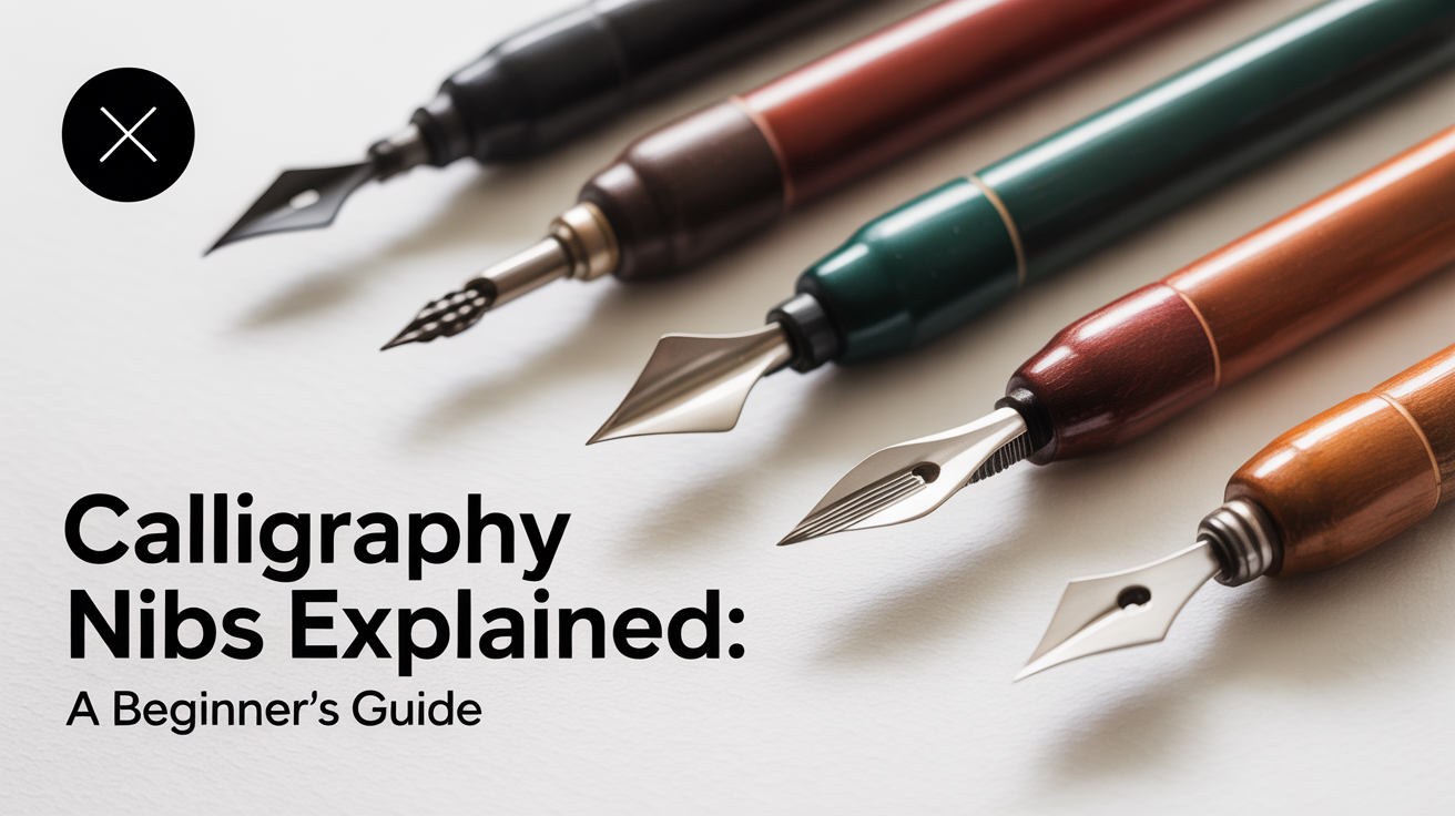
The Main Types of Calligraphy Nibs
Pointed Pen Nibs
Pointed pen nibs are the classic calligraphy nib, used for scripts like Copperplate, Spencerian, and modern pointed-pen lettering. The tip comes to a point, and all the line variation comes from pressure.
There are two broad subcategories:
Flexible nibs spread easily and produce dramatic thick-thin contrast. They reward a light, controlled touch. Because they're responsive, beginners often dig them into the paper trying to force ink out, which catches the tip and splatters. If this happens to you, lighten your grip.
Semi-flexible or stiff nibs require more deliberate pressure before the tines open. They're more forgiving for beginners because they don't punish small inconsistencies as harshly. A good starting choice is a medium-flexibility nib in a size labeled "EF" (extra fine) or "F" (fine), these are common letter markings on pointed nibs, referring to the tine width at rest, not necessarily the finished stroke size.
Broad-Edge (or Chisel) Nibs
Broad-edge nibs have a flat, chisel-shaped tip rather than a point. Line variation comes from the angle you hold the nib relative to your writing lines, not from pressure. These are used for scripts like Italic, Gothic (Blackletter), and Uncial.
A broad-edge nib held at a consistent pen angle produces thick strokes on vertical and diagonal downstrokes and thin strokes on horizontal strokes. Changing the angle changes the thick-thin pattern. Broad-edge nibs are often mounted directly into a pen holder (like a cartridge) or come in dip pen sets with interchangeable widths.
Scroll Nibs and Music Nibs
These are specialty nibs with multiple tines that lay down parallel lines at once. A music nib, originally designed for writing musical notation, has three tines. A scroll nib produces two or more stripes of ink simultaneously. Beginners don't need these to start, but they're fun to try once you're comfortable with basic nib handling.
Choosing a Starting Nib
The honest answer: pick one, try it, and adjust from there. You'll learn more from ten minutes of actual writing than from an hour of research.
That said, here's a practical starting framework:
| Style you want to learn | Nib type to start with | Starting pen angle |
|---|---|---|
| Copperplate / modern lettering | Flexible pointed pen, medium stiffness | Varies (follow style guides) |
| Italic / Foundational | Broad-edge, 2–3mm width | 45 degrees |
| Gothic / Blackletter | Broad-edge, 1.5–2mm width | 30–45 degrees |
| Spencerian | Light-flex pointed pen | Varies |
For most beginners drawn to swirly, thick-thin scripts, a medium-stiffness pointed pen nib is the right starting tool. Look for nibs sold in beginner or starter packs, they're usually calibrated to be forgiving.
One thing that surprises many beginners: the nib size labeling (EF, F, M, B) is not standardized across manufacturers. An "EF" nib from one brand may write finer or broader than an "EF" from another. Treat the markings as rough guides, not precise specs.
For more on what to buy alongside your first nib, see The Best Calligraphy Starter Kit: What You Actually Need.
Nib Fit: Holders and Compatibility
A nib is only as useful as its holder, and not all nibs fit all holders.
Straight holders have a simple ferrule (the metal ring or collar at the tip) that grips the nib's shank. Most pointed pen nibs have a "universal" shank that fits standard ferrules, but the fit varies enough that a loose nib is a common beginner frustration. If a nib wobbles, the nib isn't seated correctly, press the shank gently inward until you feel it snap against the ferrule prongs.
Oblique holders have an angled flange that positions the nib at an angle to the paper, helping right-handed writers achieve the steep nib angle common in Copperplate without twisting their wrist. Oblique holders are popular for Copperplate and Spencerian. If you're trying to figure out which holder style suits your grip, Straight vs. Oblique Pen Holders: Which to Choose walks through the tradeoffs.
Broad-edge nibs often come with their own dedicated holders or cartridge-style adapters, so compatibility is usually handled by the set.
Preparing and Caring for Your Nibs
New nibs come with a thin factory coating (usually oil or lacquer) that repels ink. If ink beads up and rolls off your new nib the first time you use it, this is why.
Remove the coating before first use with any of these methods:
- Pass the nib briefly through a flame (a lighter or candle) for one to two seconds, then wipe with a soft cloth. Don't hold it in the flame, just a quick pass.
- Push the nib gently into a raw potato or apple for 30 seconds, then wipe. The mild acids do the work.
- Scrub lightly with an old toothbrush and a small amount of toothpaste (plain, not gel), rinse, and dry.
After each writing session, rinse the nib under cool water and dry it thoroughly before storing. Even a thin film of dried ink left in the slit will clog the nib and affect flow the next time you use it.
Nibs wear out. Steel pointed pen nibs in particular are consumables, with regular use, the tip rounds or the tines develop a burr (a tiny rough edge that scratches rather than glides). Most calligraphers who write regularly expect to replace their pointed pen nibs every few weeks to months, depending on how much they write and how hard the paper is. When a nib starts snagging the paper or producing inconsistent lines despite clean technique, it's usually time to retire it.
Store nibs in a small tin or case rather than loose in a drawer where they can knock against each other and bend.
Ink and Paper, Why They Matter for Nib Performance
A nib doesn't perform in isolation. The ink and paper in front of you directly affect how the nib feels.
Ink viscosity: Thin inks flow easily but may spread (called "feathering") on absorbent papers. Thick inks produce crisper lines but can clog fine nibs. A good starting ink is an iron gall or black drawing ink designed for dip pens, these are calibrated to flow through pointed nibs without gumming up.
Paper smoothness: Rough or textured papers catch nib tips, especially flexible pointed nibs. Smooth, hot-press papers let the nib glide. Coated papers repel ink. For practice, a smooth cartridge paper or a paper designed for calligraphy practice is ideal. You don't need anything expensive to start.
Humidity: Ink behaves differently in a dry room versus a humid one. If you're practicing in winter with the heat on and your ink seems thicker than usual, this is likely why. Adding a tiny amount of distilled water can help thin it slightly, but go slowly.
If you're exploring lettering with brush pens alongside dip nibs, The Best Brush Pens for Beginners covers a different tool family with its own set of considerations.
Frequently Asked Questions
Do I need an expensive nib to start?
No. Beginner calligraphy nibs are genuinely inexpensive, often a dollar or two each, or less when bought in sets. Spending more at the start doesn't make learning easier. A moderately priced medium-flex nib in good condition will teach you far more than a specialty nib you're afraid to press on.
Why does my ink keep splashing off the nib?
Two common causes: the factory coating hasn't been removed (see the preparation steps above), or the ink is too thick and built up a blob that dropped when you moved the pen. Check both before assuming the nib is defective. If you've treated the nib and the problem continues, the nib may be slightly bent, even small deformations affect flow.
How do I know when a nib is worn out?
The clearest sign is that the nib snags or scratches the paper on upstrokes that it used to glide through. Another sign is that lines become inconsistent even when your technique feels steady. Worn tines lose their smooth, polished tip and develop micro-burrs. At that point, replace the nib, trying to force a worn nib to perform is frustrating and teaches bad habits.
Can I use fountain pen ink in a dip pen nib?
Many fountain pen inks work fine in dip pen nibs, but not all. Pigmented or heavily dye-based inks can clog fine nibs quickly. Iron gall inks are generally safe for both. Always rinse the nib thoroughly after using any ink. When in doubt, test a small amount before committing to a long writing session.
Why do my thick and thin strokes look uneven?
Uneven thick-thin contrast usually comes from inconsistent pressure, not a faulty nib. Beginners often apply more pressure on some downstrokes than others without realizing it. Slowing down and focusing on deliberate, even pressure on each downstroke helps. Shaky or wobbly strokes early on are completely normal, they smooth out with practice, not with more expensive supplies.