Tools & Supplies
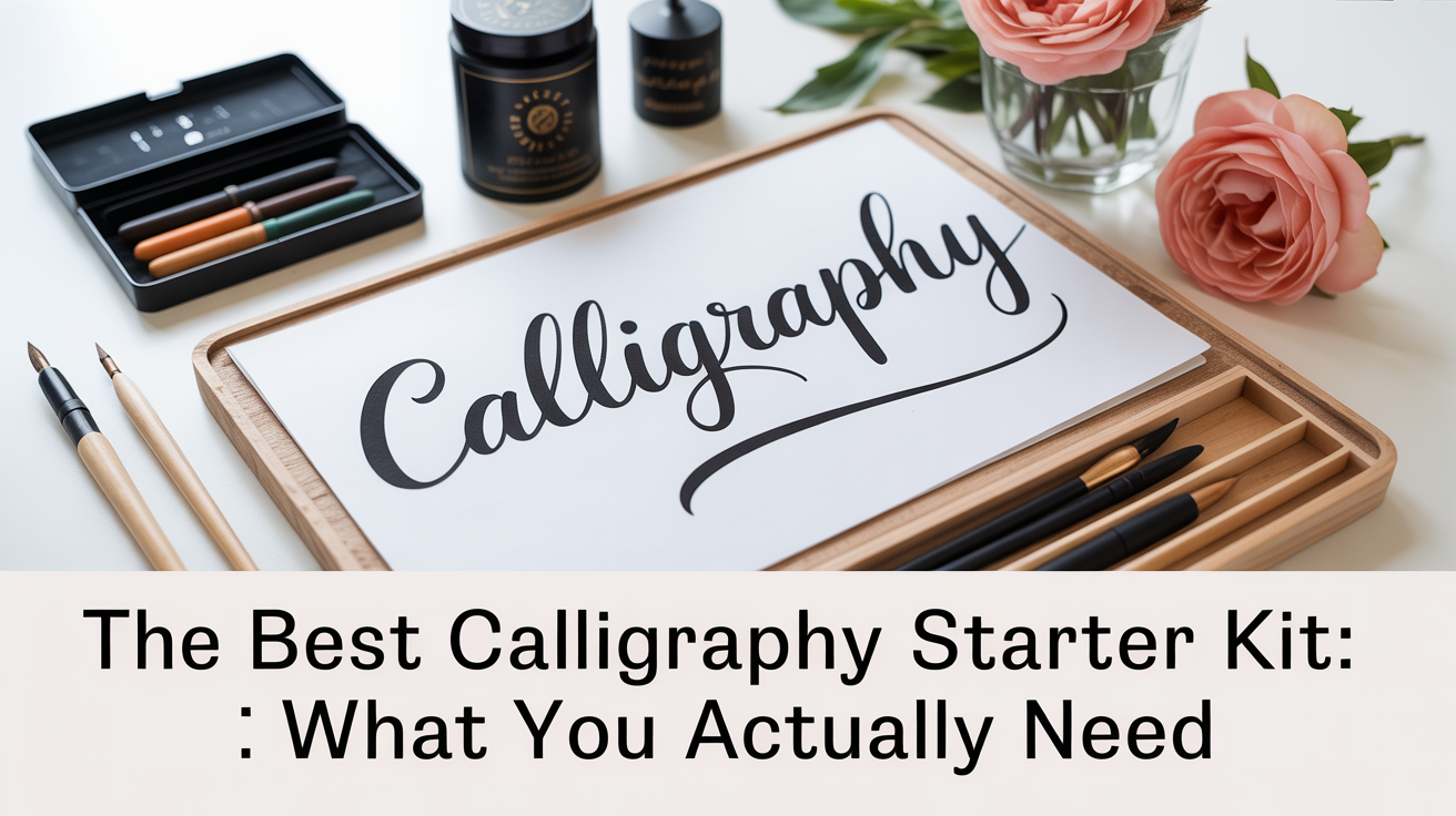
The Best Calligraphy Starter Kit: What You Actually Need
A practical guide to calligraphy supplies for beginners: which nibs, inks, paper, and holders to start with, and what you can skip.
Walk into any art store and the calligraphy aisle looks like a riddle: rows of glass-tipped nibs (the small metal writing points), oddly-angled pen holders, bottles of ink in a dozen shades, and pads of paper labeled with measurements you've never heard of. It's easy to buy too much and still end up with the wrong things.
Good news: a solid beginner calligraphy starter kit is shorter than you think. You need four things, a nib, a holder, an ink, and paper. Everything else is optional until you've practiced enough to know what you actually want to add. This guide walks you through each item, explains the jargon, and gives you a clear starting point so you can spend your time writing instead of second-guessing supplies.
Note: Brush & Nib is an independent educational resource. We're not affiliated with, sponsored by, or endorsed by any supply brand mentioned here. Tool behavior varies with your specific nib, ink, paper, and even the humidity in your room, so treat these as starting points, not rules.
The Four Things You Actually Need
A Nib
A nib is the small metal tip that sits at the end of the pen and touches the paper. Most calligraphy nibs are designed to flex: press lightly on the upstroke (moving away from your body) and the two halves of the nib (called tines) stay together, producing a thin line. Press gently on the downstroke (moving toward your body) and the tines splay apart slightly, releasing more ink and creating a thicker line. That contrast between thin and thick strokes is what gives pointed-pen calligraphy its distinctive look.
For complete beginners, a medium-flexibility nib is the most forgiving starting point. Very stiff nibs produce less variation, which is easier to control but limits the look. Very flexible nibs reward consistent pressure but punish inconsistency by catching on the paper and spraying ink. A medium nib gives you contrast without throwing ink across the page every time you push too hard.
Round-nib styles (used for italic and copperplate calligraphy) have a pointed tip rather than a flat edge. Flat-edged nibs suit a different style called broad-edge or Roman calligraphy, where the angle of the nib to the paper creates the thick-thin contrast rather than pressure. If you've seen gothic or italic lettering with wedge-shaped thick strokes, that's broad-edge work. Decide which style appeals to you before buying, a pointed nib and a broad-edge nib are not interchangeable. This guide focuses on pointed-pen nibs, which are the most commonly available in starter kits.
Nibs need to be cleaned after every session. Leaving ink to dry on the nib causes it to corrode and clog. A soft cloth or paper towel and clean water is all you need.
Learn more about how nibs work and which shapes do what in our nib explainer for beginners.
A Pen Holder
The holder is the handle the nib slots into. There are two main types: straight holders and oblique holders.
A straight holder is exactly what it sounds like, a rod you hold like a pencil, with the nib at the tip. It's a good starting point because the grip is intuitive and the nib sits directly in line with your hand.
An oblique holder has a small flange (a side-mounted nib socket) that angles the nib away from the barrel at roughly 45 degrees. This angle helps right-handed writers keep the nib aligned with the slant of the letters without twisting their wrist into an awkward position. Left-handed writers generally do better with a straight holder because the oblique's angle works against their natural hand position.
Either type works for learning. If you're right-handed and plan to practice pointed-pen scripts (like Copperplate or Spencerian, which use a steep slant), an oblique holder will feel more natural once you get past the first hour of adjustment. If you want to compare them in detail before buying, see our guide to straight vs. oblique pen holders.
Holders come in wood, acrylic, or resin. The material doesn't affect how the nib performs, buy whatever fits your hand comfortably and won't slip during long practice sessions.
Ink
Calligraphy ink is thicker than regular fountain-pen ink. It needs enough body to cling to the nib's tines and flow smoothly onto the paper without flooding. The two most practical options for beginners are:
Pigmented or India ink: Dense, opaque, and black or dark brown. Dries to a waterproof finish. India ink is widely available and inexpensive. The downside: it can dry in the nib quickly, so you need to rinse more often during a session.
Gum arabic-based writing ink (sometimes called copperplate ink): Slightly less dense than India ink but designed for pen work. Flows more reliably on the nib and is gentler on metal. This is often the default recommendation for beginner pointed-pen work.
Avoid fountain-pen inks (too thin, they flood the nib), acrylic craft paint thinned with water (it dries mid-letter and clogs), and any bottle that doesn't say it's safe for metal nibs.
A standard 2 oz bottle of ink will last a long time for practice sessions, you don't need a large quantity to start.
Paper
Paper is the part of a beginner calligraphy set that people most consistently underestimate. Cheap printer paper has a slightly fuzzy surface: the ink bleeds sideways into the fibers and the nib catches on the surface, causing ink splatter and frustrating line breaks.
What you want is a smooth (sometimes labeled "HP" for hot-press) paper with enough weight to handle liquid ink without warping. Marker paper and layout pads work well. Papers marketed as "calligraphy practice pads" often have printed guidelines (horizontal lines for letter height, sometimes with angle guides) which are genuinely helpful for beginners.
Look for paper in the 70–90 gsm (grams per square meter) range for practice. Lighter than that will bleed; heavier is fine but unnecessary for daily drills.
Avoid textured watercolor paper, cardstock, and anything with a coating (like photo paper), ink won't stick to coated surfaces.
What a Starter Kit Checklist Looks Like
Here's a practical list organized by priority:
| Item | What to Look For | Priority |
|---|---|---|
| Pointed nib | Medium flexibility, corrosion-resistant steel | Essential |
| Pen holder | Straight (both hands) or oblique (right-handed) | Essential |
| Calligraphy or India ink | Dense, designed for metal nibs | Essential |
| Practice paper | Smooth, 70–90 gsm, with guidelines | Essential |
| Small ink pot with a narrow mouth | Prevents spillage while dipping | Helpful |
| Nib cleaning cloth | Any soft lint-free cloth | Helpful |
| Tracing paper | For practicing over printed exemplars | Optional |
| Light pad or lightbox | To see guidelines through thicker paper | Optional later |
A basic dip-pen starter set from most art suppliers bundles two or three holders, five to ten nibs, and a small ink bottle. These entry-level bundles are genuinely useful, the nibs are usually interchangeable, so you get to try a couple of different flex levels before committing to a favorite.
Setting Up Before Your First Practice Session
Getting set up correctly makes a real difference in your first session. Follow these steps:
-
Prepare the nib. New nibs are coated with a thin layer of machine oil to prevent rust during storage. That oil repels ink. Before your first use, wipe the nib with a soft cloth soaked in rubbing alcohol, or pass it briefly through a flame (hold it by the holder, move it quickly, just two seconds), then rinse and dry. After this, ink should sheet evenly across the nib.
-
Seat the nib firmly in the holder. It should click or grip securely. If it wobbles, it will produce uneven pressure.
-
Dip about two-thirds of the nib into the ink. You want ink on both the top and underside of the nib, if only the tip is inked, it will run dry quickly. Flick off any obvious excess.
-
Do a test stroke on scrap paper. Before touching your practice sheet, lay down a few strokes to check that ink is flowing. If it blobs immediately, you may have too much ink on the nib. If it skips, dip again.
-
Hold the pen at roughly 45 degrees to the paper. A shallower angle (nib almost flat) tends to catch the tip. A steeper angle (nib nearly vertical) reduces ink flow. 45 degrees is the standard starting position.
-
Start with the basic strokes, not letters. A straight downstroke, an oval, a loop. These are the building blocks of every letterform, and they let you find your pressure before you're also thinking about letter shapes.
Common Beginner Problems and What Causes Them
Ink splattering on the downstroke: You're pressing too hard, or the nib is catching a fiber in the paper. Try lighter pressure first, and check that your paper is smooth. New nibs sometimes have a rough edge that catches, ink the nib, then very lightly draw it across the back of your non-dominant hand a few times to smooth it.
Ink not flowing: The nib may be dry, or the angle may be too steep. Dip again, check your angle, and try a test stroke. Sometimes a new nib needs a short break-in period of five to ten minutes of light practice before it flows consistently.
Lines look wobbly: This is normal, and it doesn't go away quickly. The pressure control for pointed-pen calligraphy takes weeks to develop. Wobbly lines at the start aren't a sign that you're doing it wrong, they're a sign that you're new, which is exactly what you are. Slow, deliberate strokes tend to come out cleaner than fast ones while you're building the motor memory.
Ink bleeding sideways on the paper: The paper is too absorbent. Switch to a smoother paper.
The nib scratches and tears the paper: The nib may be bent or damaged, or you may be pressing very hard. Inspect the tines, they should be symmetrical when you look at the nib straight-on. If one tine is higher than the other, the nib is damaged and should be replaced (nibs are inexpensive, so this is not a disaster).
A Note on Brush Pens
Brush pens are a related but different tool: they have a flexible felt or synthetic brush tip rather than a metal nib, and they hold their own ink. They're popular for modern calligraphy and brush lettering because there's no dipping, no ink spills, and no nib preparation. If you want to try calligraphy with less setup complexity before committing to a dip-pen kit, brush pens are a reasonable on-ramp.
The downside is that the thick-thin contrast they produce is softer and less crisp than a steel nib. The skill doesn't translate directly, brush pen technique and dip-pen technique are related, but the pressure mechanics feel quite different.
If you think brush pens might be the right starting point for you, we have a practical rundown of what to look for in brush pens for beginners.
Frequently Asked Questions
Do I need an expensive starter kit to learn calligraphy?
No. The most important variables are nib flexibility, ink consistency, and paper smoothness, none of which require a high price tag. An entry-level dip-pen bundle (often under $15–20) gives you enough to learn proper technique. Invest more once you know what you prefer.
How many nibs should a beginner buy?
Two or three is plenty to start. Nibs do wear out, and they're inexpensive enough to replace, but you'll probably use the same one or two nibs for your first several months. Having a spare on hand is useful in case one gets bent.
Can I use a fountain pen instead of a dip pen?
A calligraphy-specific fountain pen (sometimes called a calligraphy pen or italic fountain pen) is a different tool from a pointed-pen dip pen. Fountain pen calligraphy nibs are usually broad-edge nibs built into a self-filling pen. They're convenient, no dipping, but they produce a different style of lettering. If you want the classic thick-thin contrast of Copperplate or modern pointed-pen scripts, a dip pen is the right tool.
What's the best way to clean nibs after a session?
Rinse the nib in clean water, then dry it with a soft cloth before storing it. Do not leave a nib soaking, prolonged water exposure causes rust. If ink has dried on a nib, soak it briefly in water to dissolve the residue, then clean and dry. Store nibs in a dry place, not in a sealed container where moisture can accumulate.
How long before my letters start looking good?
That varies by how often you practice and which style you're working on. Most people see noticeable improvement in stroke consistency within two to four weeks of daily 20-minute practice sessions. Recognizable letterforms come next. Polished, confident-looking letters typically take several months. The early wobbles are part of the process, every calligrapher you admire started with the same shaky first strokes.