Getting Started
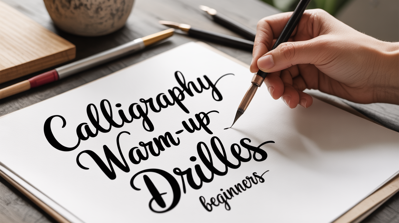
Calligraphy Warm-Up Drills for Beginners
Learn essential calligraphy warm-up drills to loosen your hand, build muscle memory, and write smoother letterforms from your very first session.
Before you write a single letter, spend five minutes on drills. That sentence might feel anticlimactic if you just opened a new pen and are eager to start, but those five minutes make everything that follows easier. Calligraphy warm-up drills (short, repeated mark-making exercises) loosen stiff muscles, remind your hand of the angles involved, and smooth out the shakiness that almost everyone experiences at the start of a session. Think of them the way a pianist runs scales: not glamorous, but genuinely useful.
This guide walks you through a set of practical lettering warm-up exercises you can do on any practice paper before each session. No fancy supplies needed.
Why Warm-Up Drills Actually Help
Your hand is full of small muscles that control fine motor movement. When you sit down after a day at a keyboard or a night of sleep, those muscles are tight and unprimed for the precise, slow movements calligraphy requires. Drills activate them gradually so that by the time you form real letters, the motion feels natural rather than forced.
There is also a mental benefit. Drills are low-stakes. You are not trying to produce a finished piece, so you can focus entirely on how pressure feels against the page and how the ink flows. That attentiveness carries into your lettering.
A short but consistent warm-up routine also builds muscle memory over time. Muscle memory is the body's ability to reproduce a motion reliably without conscious effort, the same reason you can ride a bike without thinking about balance. With calligraphy, that means your downstrokes (the lines you pull toward yourself, which carry more pressure) start to fall at the right angle automatically.
What You Need Before You Start
You do not need special drill sheets. Any smooth practice paper will do. Loose printer paper works, though a paper with a bit more tooth (gentle surface texture) helps ink adhere more evenly. Ruled paper can actually be useful for drills because the lines give you a visual reference for height.
For tools:
- Dip pen: a flexible nib in a standard holder is ideal. A nib with some flex lets you feel the difference between light upstrokes and weighted downstrokes clearly.
- Brush pen: a felt-tip or real-hair brush pen works equally well. Brush pens respond to pressure the same way dip nibs do; the tip splays under pressure to create thick lines.
- Ink or cartridge: whatever you normally use. Warm-ups are not the time to test a new, expensive ink.
Keep a scrap of paper nearby to blot the nib or brush tip before you begin.
Core Calligraphy Drills to Practice Every Session
Work through these in order. Each one builds on the physical awareness developed by the last.
1. Parallel Lines (Downstrokes)
The downstroke is the backbone of most calligraphy styles. Getting it consistent is more important than almost anything else.
- Hold your pen or brush at roughly a 45-degree angle to the page, or at whatever angle suits your style. If you are unsure, read more about how to hold a calligraphy pen before starting.
- Apply gentle pressure and pull the pen straight down toward yourself in a slow, deliberate stroke.
- Lift, reposition at the top, and repeat. Aim for lines that are parallel and evenly spaced.
- Fill two or three rows without stopping to judge individual lines. Rhythm matters more than perfection here.
If your lines wobble, slow down further. Speed is the enemy of consistent calligraphy, especially for beginners. Shaky lines are normal at the start of any session, and they should smooth out after a minute or two of practice.
2. Upstrokes
Upstrokes (thin lines you push away from yourself) should be nearly weightless. The contrast between a heavy downstroke and a thin upstroke is what gives pointed pen calligraphy its characteristic look.
- Start at the bottom of your practice area.
- Lift pressure almost completely and push the pen upward at a slight diagonal, the same angle you would use for a letter like lowercase "u."
- The line should be noticeably thinner than your downstrokes. If it is not, reduce pressure further.
- Alternate rows of downstrokes and upstrokes so your hand gets used to switching between them.
3. Ovals
Ovals (elongated, slightly tilted circles) form the basis of letters like "a," "o," "d," "g," and "q." Drilling them separately means you are not learning the shape for the first time inside a letter.
- Draw a circle, then deliberately tilt it slightly to the right (for a right-leaning style) or keep it upright (for print-style lettering).
- Apply more pressure on the left side of the oval as you travel downward, and release pressure as you curve back up on the right.
- Aim for consistent size. Use your ruled lines as a guide: the oval should sit neatly between the baseline (the line letters rest on) and the x-height line (the top of lowercase letters like "a" or "o").
- Repeat until you can produce five ovals in a row that are roughly the same size and tilt.
4. Compound Curves
A compound curve is a stroke that shifts direction once, like a letter "n" or "m" shape. It combines an upstroke and a downstroke in a single connected motion.
- Start at the baseline, push up with light pressure.
- At the top, curve over and pull down with more pressure.
- Release pressure again at the bottom and loop back up for the next repetition, creating a rhythm like "up-over-down, up-over-down."
This drill is particularly useful because it trains the pressure transition in real time. The moment when you shift from upstroke to downstroke is where beginners tend to stall or press too hard too early.
5. Loops (Ascender and Descender Lines)
Loops appear in letters like "l," "h," "f," "g," and "y." They extend above or below the main body of the letter into what calligraphers call the ascender zone (above x-height) and descender zone (below the baseline).
- Draw a tall upstroke that extends well above your x-height line.
- Loop over and back down, applying pressure as you descend.
- For descender loops, do the reverse: pull down past the baseline, then loop back up with a thin upstroke.
Loops can feel awkward at first because they require the hand to move in a continuous arc. Keep the motion fluid rather than stopping at the top or bottom of the loop.
A Simple 5-Minute Warm-Up Routine
Here is how to combine the drills above into a quick pre-session routine:
| Time | Drill | Goal |
|---|---|---|
| 1 min | Parallel downstrokes | Loosen hand, find angle |
| 1 min | Upstrokes | Practice light pressure |
| 1 min | Ovals | Consistent size and tilt |
| 1 min | Compound curves | Smooth pressure transitions |
| 1 min | Loops | Fluid extended strokes |
You do not need to fill every row perfectly. The goal is movement, not a flawless page.
Common Beginner Mistakes (and Easy Fixes)
Moving too fast. Speed causes wobble. If your lines look shaky, halve your speed before trying anything else.
Gripping too tightly. A tight grip tires your hand and makes fine control harder. Rest the pen lightly in your fingers. If your knuckles are white, loosen your hold.
Pressing too hard on upstrokes. This can splay a dip nib, spread a brush tip, or create thick lines where you want thin ones. Upstrokes should feel almost weightless.
Skipping the warm-up when short on time. Even two minutes of downstrokes is better than jumping straight into lettering. The drills pay for themselves quickly.
If you are brand new to the difference between calligraphy styles, check out calligraphy vs. hand lettering to understand how these drills fit into different approaches.
When Drills Start to Feel Boring
That is a good sign. Boredom in drills usually means the motion is becoming automatic, which is exactly the goal. At that point, you can increase difficulty by tightening your spacing (fitting more strokes per row), slowing down further, or shifting to drills on blank, unlined paper where you have to maintain a consistent baseline on your own.
Some calligraphers never stop doing drills before every session, even after years of practice. Others phase them out once muscle memory is solid. Neither approach is wrong. If your sessions feel stiff or your letterforms look inconsistent, drills are almost always worth revisiting.
For a way to practice without committing to formal letterforms right away, faux calligraphy is another good entry point alongside drills. It builds your eye for stroke contrast using any regular pen before you add a nib or brush to the mix.
Frequently Asked Questions
How long should I warm up before a calligraphy session?
Five minutes is enough for most beginners. You are aiming to loosen your hand and get ink flowing evenly, not to exhaust yourself before the main work. If you have more time, ten minutes is fine, but the returns diminish quickly once your hand is warmed up.
Do I have to do drills every single time I practice?
Not strictly. But many beginners find their first few minutes of actual lettering look notably worse than the rest of the session. A short drill routine closes that gap. If you practice every day, you may need less warm-up over time as your hand stays conditioned.
My downstrokes are still shaky after warming up. What am I doing wrong?
Shakiness usually comes from moving too fast or holding the pen too far from the nib. Try slowing down to a pace that feels almost tediously slow, and check that your hand is anchored gently against the paper rather than floating above it. If shakiness persists after several sessions, it is simply your hand learning a new skill, not a sign that something is fundamentally wrong.
Can I use a ballpoint pen for warm-up drills?
You can practice the shapes and movements with a ballpoint, but you will not get pressure feedback since ballpoint tips do not respond to light or heavy pressure the way a nib or brush does. It is still useful for muscle memory, just not a full substitute for practicing with your actual calligraphy tool.
What paper is best for drills?
Smooth, semi-glossy paper reduces nib snag and lets ink flow evenly, which makes drills feel cleaner and more accurate. Rough or highly textured paper can catch the nib and add artificial wobble that is not your fault. Cheap laser-printer paper is a perfectly acceptable starting point.