Projects
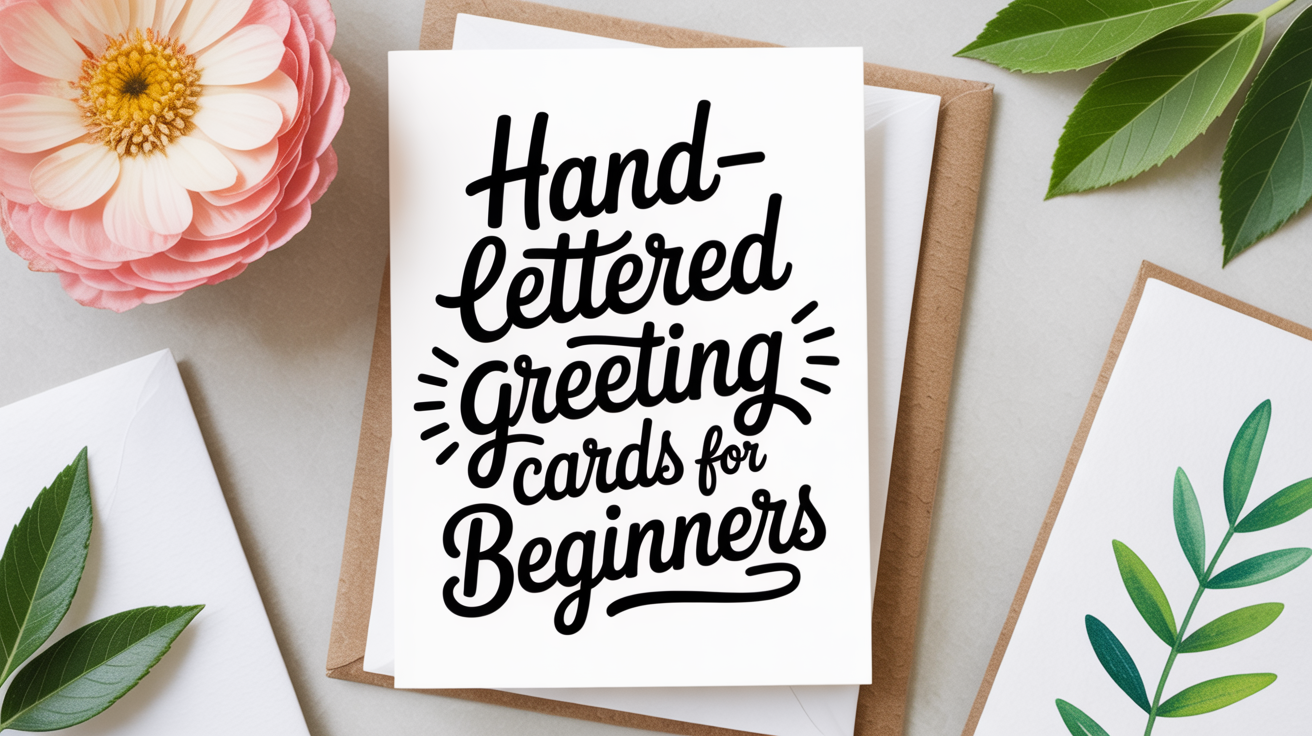
Hand-Lettered Greeting Cards for Beginners
Learn how to make hand-lettered greeting cards from scratch. Supplies, layout tips, and step-by-step instructions for true beginners.
Making a hand-lettered greeting card feels rewarding in a way that a store-bought one simply doesn't. You control every word, every curve, and every flourish. The result is something the recipient is likely to keep long after the occasion has passed.
This guide walks you through the whole process: choosing your supplies, planning your layout, lettering the card, and adding finishing details. No prior experience required. Your first card will not look perfect, and that's expected. What matters is that you start.
What You'll Need
Before putting pen to paper, it helps to gather a small set of supplies. You don't need to buy everything at once. Start with the basics and add tools as you grow.
Paper and Card Stock
The single biggest variable in how your lettering looks is the paper. Smooth, heavyweight card stock (at minimum 80 lb / 216 gsm) prevents ink from bleeding, meaning it doesn't spread into the surrounding fibers and feather outward like a frayed edge.
For practice, use smooth marker paper or laser-printed copy paper, not rough sketch paper, which will shred your brush tip. For the final card, look for card stock labeled "smooth" or "vellum surface." A standard card blank (A2 size, about 4.25 x 5.5 inches) is a comfortable format to work with.
Lettering Tools
You have two main paths:
| Tool | Learning Curve | Best For |
|---|---|---|
| Brush pen (soft tip) | Moderate | Flowing scripts, modern lettering |
| Pointed nib + ink | Steeper | Traditional calligraphy, fine hairlines |
| Dual-tip marker | Low | Bold block letters, sans-serif styles |
A brush pen is often the easiest starting point. It's self-contained, consistent, and forgiving. The tip flexes under pressure: press down on a downstroke (pulling the pen toward you) to thicken the line, and use a light touch on an upstroke to keep it thin. That contrast between thick and thin is the defining quality of brush script.
If you want to try a pointed nib, you'll also need a nib holder and a small bottle of ink. The nib is the metal tip that attaches to the holder; its two tines (the prongs that split when you press) release ink onto the page.
Other Supplies
- A pencil and ruler for light guide lines
- A kneaded eraser (soft, leaves no residue)
- Washi tape or masking tape to anchor your card while you letter
- A bone folder or butter knife to score fold lines cleanly
- Optional: watercolor paints, colored pencils, or stamps for decorative borders
Planning Your Layout Before You Letter
Jumping straight to ink is tempting, but a quick pencil sketch saves real frustration. A layout is simply a map of where each element will sit on the card.
Start by deciding on your hierarchy: what is the most important phrase? That text should be the largest or most prominent. Secondary text, a name, a date, a short message, sits smaller beneath it.
For a standard greeting card, a reliable layout looks like this:
- Fold your blank in half and mark the center with a light pencil dot.
- Write your main phrase in pencil, centering it visually (not just by measurement) around that dot.
- Sketch the secondary text below, smaller, in a complementary style (if the main text is script, consider simple print for the secondary line for contrast).
- Leave breathing room at the top and bottom margins, at least half an inch on each side.
A common beginner mistake is crowding text toward the top. Centering the whole composition vertically, with equal margins top and bottom, almost always looks more balanced than you'd expect.
For more detailed guidance on balancing multiple lines of text, the article on layout and composition for lettered quotes covers the underlying principles in depth.
Lettering the Card Step by Step
Once your pencil layout is approved by your own eye, you're ready to ink.
-
Anchor the card. Tape it lightly at the corners so it doesn't shift mid-stroke. This is especially important for longer messages.
-
Draw light guide lines in pencil. A baseline (the line your letters sit on) and an x-height line (the height of a lowercase "x" in your style) help keep letters consistent. For a small card, 3–4mm x-height is a readable size for body text; 8–10mm for a large focal phrase.
-
Letter the main phrase first. Work slowly. Brush lettering rewards deliberate strokes, not speed. If a stroke goes wrong, don't try to correct it mid-letter. Finish the word, let the ink dry, and evaluate.
-
Let the ink dry completely before moving to secondary text. Smudging a freshly inked main phrase is one of the most discouraging things that can happen. Even a minute of drying time makes a difference.
-
Add secondary text and any decorative elements. Small leaves, simple stars, tiny dots, or thin ruled lines are all achievable with a fine-tip pen or the tip of your brush pen. Keep it proportional; a border that competes with your lettering pulls attention rather than framing it.
-
Erase pencil lines. Use a kneaded eraser and work gently. Give the ink an extra minute before erasing if it seems at all tacky.
-
Check the back. Hold the card up to a light source to confirm ink hasn't bled through to the back panel. If it has, that's useful feedback for your next card: try a heavier card stock or a less saturated ink.
Styles That Work Well for Cards
Not every lettering style suits every occasion, and experimenting is part of the enjoyment.
Brush script is warm and informal. It fits birthday cards, thank-you notes, and casual celebrations.
Copperplate or pointed-pen script is elegant and precise. It suits wedding cards, formal invitations, and anything that benefits from a refined look.
Block letters or sans-serif print is clean and graphic. It works well for modern minimalist cards, gift tags, and any design where you want the words to read at a glance.
A mixed approach is often the most visually interesting: use a brush script for the focal phrase and simple print for the rest. The contrast lets each element breathe.
You can also integrate simple flourishes. A flourish is an extended decorative stroke, usually attached to a capital letter or the tail of a final letter. If you're curious about adding them, an introduction to flourishing in calligraphy is a good next step once your basic letterforms feel steady.
Addressing the Envelope
A hand-lettered card deserves an envelope to match. You don't need elaborate calligraphy for the address, even a clean, consistent print style looks intentional when done carefully.
A few pointers:
- Use the same pen or ink you used on the card so the look is cohesive.
- Write the recipient's name on the first line slightly larger than the street address below it. This creates a natural hierarchy.
- If your envelope paper is slippery or coated, test a corner first. Some inks bead up on glossy surfaces; you may need a pigment-based ink or a fine-tip pen instead.
For a fuller walkthrough of calligraphed envelopes, including how to handle numbers and return addresses, the guide on addressing envelopes in calligraphy covers it in practical detail.
Common Problems and How to Handle Them
| Problem | Likely Cause | Fix |
|---|---|---|
| Ink bleeds or feathers | Paper too textured or porous | Switch to smoother card stock |
| Letters look uneven | No guide lines | Pencil in a baseline and x-height before inking |
| Brush tip splits mid-stroke | Too much pressure, or tip is dry | Ease pressure; re-moisten tip on a scrap sheet |
| Ink skips or won't flow | Nib is new (has factory coating) | Rub nib gently with a toothbrush and dish soap, rinse, dry |
| Smudging | Resting hand on wet ink | Work left to right (if right-handed), or use a clean scrap sheet under your hand |
| Composition looks off-center | Centering by eye without anchoring | Measure midpoint of each line and mark lightly with pencil |
Every one of these problems is solvable and happens to experienced letterers too. The difference is that with practice, you recognize and correct them faster.
Frequently Asked Questions
Do I need calligraphy experience to make a hand-lettered card?
No. Modern brush lettering is its own skill, distinct from traditional dip-pen calligraphy, and many beginners find it accessible with a few hours of practice. The key is starting with a medium-tip brush pen on smooth paper and focusing on consistent pressure changes before worrying about style.
What size card is easiest to start with?
An A2 card (4.25 x 5.5 inches, fitting a standard A2 envelope) is a comfortable beginner size. It's large enough to letter without cramping your hand but small enough that a single phrase fills the face nicely. Half-fold a sheet of card stock if you don't have pre-cut blanks.
Can I use regular markers instead of brush pens?
You can, especially for block lettering or print styles. Regular markers don't flex, so you won't get the thick-and-thin variation of brush script. That's fine; some card styles actually look better with uniform stroke weight. Just confirm the marker is waterproof if you plan to paint over or around the lettering.
How do I fix a mistake in ink?
Let the ink dry fully, then try a white gel pen or white opaque ink to cover the error. For small mistakes this works well, especially on darker or textured card stock. On smooth white card stock, small errors are harder to hide; you may prefer to start on a fresh card. This is why pencil layout and practice on scrap paper first matters so much.
How long does it take to make one card?
A simple card with a short phrase takes 20 to 30 minutes once you've done a pencil sketch and a practice run. A more elaborate card with a border, multiple text sizes, and a flourished capital can take an hour or more. Budget extra time for the first few cards while you're still figuring out your tools.