Projects
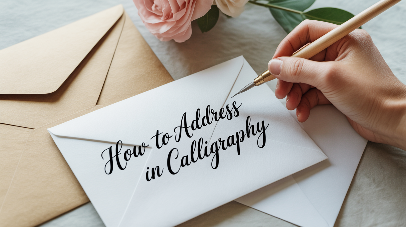
How to Address Envelopes in Calligraphy
Learn how to address envelopes in calligraphy with this beginner-friendly guide covering tools, layout, ink, and common mistakes to avoid.
Calligraphy envelope addressing looks elegant, but it's one of the most practical skills you can build as a beginner. You're working on a bounded surface, there's a clear goal, and your practice has a real use at the end. Whether you're doing a single birthday card or a stack of wedding invitations, the same handful of techniques carries you through.
This guide covers everything from choosing your tools to spacing lines correctly on the envelope face, with notes on what actually goes wrong for beginners and how to fix it.
What You Need Before You Start
Addressing envelopes doesn't require a full calligraphy setup. A few focused choices make a big difference.
The pen
For pointed-pen calligraphy (the style most commonly used for envelope addressing), you'll use a dip pen: a pen holder with a removable metal tip called a nib (the nib, short for nibpoint, is what you dip into ink and draw across the paper). Nibs have two prongs called tines that spread apart under pressure to produce thick downstrokes (lines you pull toward you) and snap back together for thin upstrokes.
For envelope work, a medium-flex nib is easier to control than a very springy one. Stiff nibs in the fine-to-medium range are good when you want consistent, reliable lines without fighting the nib. A very flexible nib requires more consistent pressure and takes time to learn.
Brush pens are another option. A pointed brush pen with firm bristles (not too floppy) gives you similar thick-and-thin contrast with less setup. They work well on smooth envelopes and don't require ink prep.
The ink
Waterproof, pigment-based ink is the practical choice for mailed envelopes. It dries without smearing in a mailroom. Black is the most legible, but metallic gold or silver inks show up well on dark envelopes.
Avoid fountain-pen ink for dip pens, it's too thin and spreads unpredictably. Acrylic-based ink is common and generally reliable, though very thick ink needs a drop of water to flow smoothly.
The envelope
This matters more than most beginners expect. A toothy, rough-textured envelope will catch your nib and spray ink. Look for envelopes described as smooth-coated or vellum-finish. A soft, uncoated surface that's not too fluffy is workable. If you're buying envelopes for a project, request samples and test one before committing to a box.
Dark envelopes (navy, burgundy, black) take metallic or white ink well, but white ink needs stirring before each dip and dries faster in the nib.
A pencil and ruler
More on this in the layout section, but a light pencil and a ruler for guideline marks are as important as your pen. Light pencil marks erase cleanly once the ink dries.
How to Set Up Your Layout
Measure the envelope
Before touching ink, figure out your margins. Standard A2 envelopes (fits a folded 4.25 x 5.5 inch card) and A7 envelopes (common for wedding invitations) have different proportions. The address block generally centers on the face of the envelope, both horizontally and vertically.
For a typical A7 envelope:
- The address block starts roughly one-third down from the top edge.
- Left margin: about 1.5 to 2 inches from the left edge (leaves room for postage on the right and the return address upper-left).
Measure a practice envelope before starting your real ones.
Draw light pencil guidelines
Guidelines keep your lines of text level and evenly spaced. Without them, addresses tend to drift down on the right side, which looks uneven even on otherwise beautiful lettering.
Use a ruler and a very light pencil (HB or lighter) to draw:
- A baseline for each line of text (this is the line your letters sit on).
- Optionally, an x-height line above each baseline (the x-height is the height of lowercase letters like "a", "e", or "x", not counting ascenders like the tall part of "h" or descenders like the tail of "g").
For envelope calligraphy, most people draw only the baseline, since the space between lines (interline spacing) is easy to judge by eye once you have those anchors.
Typical line spacing for calligraphy on an A7 envelope: 0.5 to 0.6 inch between baselines. Adjust for how many lines you need to fit (name, street, city/state/zip is three lines; add a fourth for an apartment number or country if needed).
Mark your center point
If you want centered text (common for wedding-style addressing), mark the horizontal center of the envelope lightly with a small pencil dot. When you write each line, you'll want to start each line at the center and work outward, but since you can't do that in real time, the practical approach is to write on scrap paper first, cut out the line, and lay it on the envelope to check visual balance before committing to ink.
Some people write the full address on a scrap strip, hold it against the envelope under a light, and trace or use it as a length reference. Others just practice enough that they can judge centering by starting position alone. Either works.
Step-by-Step: Addressing the Envelope
-
Prep your ink. Shake or stir the bottle gently. Dip the nib just past the hole (called the vent hole or breather hole) in the center of the nib, this fills the ink reservoir. Blot off excess on a paper towel or a practice scrap so you don't start with a blob.
-
Write the name first. This is usually the largest or most decorative line. Write slowly on your baseline, applying gentle consistent downstroke pressure to spread the tines and lift pressure on upstrokes. If the ink stops flowing mid-letter, don't press harder, re-dip and continue.
-
Let that line dry completely before moving to the next. Ink takes 30 seconds to a few minutes depending on paper and ink type. Touching wet ink with your hand ruins the line. Many calligraphers address a batch of envelopes moving line-by-line across all of them rather than finishing one envelope at a time.
-
Write the street address on the next baseline. Keep the letter size consistent with line 1, or slightly smaller if the name line was in a larger script.
-
Write city, state, and ZIP on the final baseline. On the city line, abbreviating the state (CA, NY, TX) is standard and reads cleanly. Write the ZIP code in a clean, legible hand, mail processing machines read it.
-
Let everything dry fully (5-10 minutes). Then erase your pencil guidelines gently with a soft eraser. Press lightly to avoid smearing any ink that didn't fully cure.
-
Add the return address. Return addresses go in the upper-left corner on the front, or on the back flap. Back-flap addressing looks polished for formal envelopes. Keep the lettering slightly smaller than the main address.
Common Mistakes and How to Fix Them
| Problem | Likely Cause | Fix |
|---|---|---|
| Ink blobs at the start of letters | Too much ink on nib | Blot before writing; don't overfill |
| Lines drift downhill on the right | No baseline guidelines drawn | Draw pencil baselines before starting |
| Ink feathers (spreads into fibers) | Envelope surface too rough or absorbent | Test paper first; try a different envelope brand |
| Ink scratches or catches | Nib tip is damaged or burr is present | Examine nib tip under light; replace if needed |
| Letters look uneven in width | Inconsistent pressure on downstrokes | Practice thick strokes in isolation on scrap paper |
| Ink won't flow on dark envelopes | White/metallic ink drying in nib | Re-dip every 2-3 letters; keep a damp cloth nearby |
| Pencil marks show after erasing | Erased before ink fully dried | Wait longer (10+ min) before erasing; test on a scrap |
Layout Styles to Know
Block style
Every line is left-aligned. Clean and straightforward. Well suited to formal or modern designs. Easy to execute because you start every line from the same left margin.
Centered style
Each line centers horizontally on the envelope face. The most traditional look for wedding invitations. Requires pre-measuring or trial strips to get the start position right for each line, since no two lines are the same length.
Cascade style
Each line indents slightly more than the one above it, creating a diagonal stair-step. Looks elegant but can make longer addresses tricky to fit. Works best when all lines are short.
For most beginner projects, block or centered are the easiest to execute neatly. Practice the centered style on plain envelopes before committing to your real supply.
If you're building confidence with laying out text for a project like this, the concepts in how to letter a quote: layout and composition translate directly to multi-line envelope work.
Tips for a Wedding or Event Batch
Addressing a large batch of envelopes at once is where beginners often underestimate the work. A realistic timeline:
- A beginner calligrapher can address roughly 4-8 envelopes per hour, including drying time and re-dipping.
- 100 envelopes takes 12-25 hours of focused work.
- Order 10-15% more envelopes than you need to account for mistakes.
Write all the names first across every envelope, let them dry, then move to street addresses, then city/state/ZIP lines. This rhythm keeps ink drying while you work and prevents accidental smears.
Store finished envelopes flat with a sheet of smooth paper between each one until you're ready to stuff them. Metallic inks, especially, can transfer if stacked while still slightly tacky.
A small decorative flourish on the name line adds elegance without slowing you down much. To learn how to add controlled loops and swashes that don't look overdone, see an introduction to flourishing in calligraphy before you add flourishes to real envelopes.
Frequently Asked Questions
Do I need expensive tools to get started?
No. A basic pen holder, a medium-flex or stiff nib, a small bottle of pigment-based ink, and a pack of smooth envelopes is enough to start. The expensive part of a calligraphy setup is usually ink variety, specialty papers, and decorative nibs, none of which you need to address envelopes well.
How do I keep text from smearing when my hand crosses the wet ink?
Work from the top of the envelope to the bottom, and always let each line dry before moving your hand over it. A small piece of scrap paper placed under your writing hand (not on wet ink) reduces skin contact with the surface. Also, giving yourself a 5-10 minute wait before erasing guidelines helps a lot.
My ink looks thin and watery on the envelope. What's wrong?
Thin lines on envelope paper usually mean you're not applying enough pressure on downstrokes, or your nib flex is very stiff. Try pressing a bit more firmly on strokes you pull toward you. If the ink itself looks pale rather than thin, the pigment in your ink may need stirring before you dip.
Can I use a regular marker or fountain pen instead of a dip pen?
You can. A pointed-tip brush marker works well for envelope addressing, especially for beginners who don't want to deal with ink dipping. Fountain pens with fine or medium nibs produce consistent lines but don't give you the thick-and-thin contrast of a flex nib. For a polished look with less setup, a quality brush pen is a reasonable starting point.
What's the right way to address an envelope for a wedding invitation?
Traditionally, the outer envelope uses formal names (Mr. and Mrs. LastName, or the full names of both partners), while the inner envelope (if your invitation set includes one) uses more casual names or first names only. Write out "and" rather than "&" in formal contexts. "Street" and "Avenue" are usually spelled out rather than abbreviated. That said, conventions have loosened considerably, what matters most is that the addressing looks intentional and beautiful.
For more ways to turn your calligraphy into something you can give away or use, hand-lettered greeting cards for beginners is a good next project once you've built confidence on envelopes.