Pointed Pen
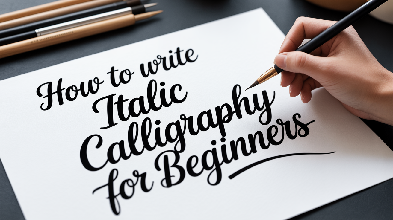
How to Write Italic Calligraphy for Beginners
Learn italic calligraphy from scratch: oval foundations, 5-degree slant, guidelines, and a letter-grouping drill sequence to build the full alphabet.
Italic calligraphy is one of the most approachable scripts for anyone picking up a pointed pen for the second time. It has a clear structure, a manageable stroke count, and produces beautiful results without demanding the extreme pressure sensitivity that more ornate hands require. If you have spent time learning basic drills and want a defined script to practice, italic is a natural next step.
What Makes Italic Different from Other Scripts
Italic calligraphy is built on compressed ovals and a consistent forward slant, typically around five degrees from vertical. Letters are upright by comparison to scripts like Copperplate, where the slant reaches 52 degrees from horizontal.
Copperplate uses dramatic thick-thin contrast with hairline upstrokes and heavy downstrokes created through pointed-pen pressure. Italic also uses a pointed pen and produces thick-thin contrast, but the contrast is more moderate and the letterforms are more geometric. Where Copperplate curves are round and flowing, italic curves are slightly flattened into a narrower oval.
This compression is the defining feature of italic. The letter o, for example, looks more like an egg standing upright than a perfect circle. All round letters in italic inherit this oval quality.
The other defining feature is the arch. In letters like n, m, h, and u, the arch springs from the stem about halfway up the x-height rather than at the top, producing a slightly angular branching shape. This is sometimes called a "springing arch" and gives italic its distinctive rhythm when written quickly.
How Thick-Thin Contrast Works in Italic
Before covering guidelines, it helps to understand where the weight falls. In italic calligraphy, thick strokes fall on downstrokes and thin strokes fall on upstrokes, just as in other pointed-pen scripts. You apply light pressure on the way up and increase pressure on the way down.
The difference from more complex pointed-pen scripts is that italic does not typically push the contrast to extremes. A moderate, consistent pressure increase on downstrokes produces clean results. Beginners who grip the pen tightly and apply heavy pressure to compensate for inconsistency will find italic forgiving because even a lighter touch creates readable letters.
A few italic-specific points on pressure:
- Entry strokes (the thin lead-in before a main stroke) are always light, no pressure.
- The main downstroke of a stem carries the most weight.
- Arches transition smoothly from a light upward move into a slightly heavier downward move.
- Exit strokes trailing off a letter are thin and released.
Setting Up Guidelines for Italic Calligraphy
Guidelines are the horizontal and diagonal lines you write between to control letter proportion. Getting them right before a practice session removes a significant variable.
Italic guidelines follow the same x-height, ascender, and descender logic as other calligraphic scripts, with a few specific ratios commonly used for foundational italic:
- X-height: 5 nib widths (for a broad-edge nib) or approximately 7-8 mm when working with a pointed pen at moderate scale.
- Ascender zone: add roughly 3-4 mm above the waistline (the top of the x-height).
- Descender zone: add the same amount below the baseline.
For practice, a common working size is an x-height of about 7 mm with ascenders and descenders extending 5 mm beyond that. This produces letters large enough to see your strokes clearly without forcing your hand to cover too much distance.
In addition to horizontal lines, italic guidelines include diagonal lines at five degrees from vertical. You can draw these yourself with a ruler and protractor, or print a pre-made italic guideline sheet. Placing your page over the guidelines (or using a light box) lets you write on clean paper while still seeing the grid beneath.
Keeping a consistent slant is one of the harder parts of italic for beginners. Slant consistency comes from anchoring your arm position and rotating the paper rather than tilting your wrist. Most italic writers rotate their paper slightly counterclockwise so the diagonal slant lines feel like natural downstrokes.
The Core Stroke Family
Every letter in italic calligraphy is built from a small set of strokes. Drilling these before attempting letters saves time and builds the muscle memory that makes letters feel controlled.
Entry stroke: A thin, slightly curved lead-in that begins below the baseline and rises to the waistline. This is the starting move of most lowercase letters.
Stem: A vertical downstroke with moderate pressure. The stem is the backbone of i, l, b, h, k, and others.
Oval: A compressed, slightly tilted oval forming the body of o, c, e, a, d, g, q. The oval is the most important shape to master because so many letters derive from it.
Arch: The branching curve that forms the top of n, m, h, u, and related letters. It springs from the stem at mid-x-height, curves upward and over, then descends into another stem.
Exit stroke: A thin, rising stroke that finishes most letters and optionally joins to the next letter.
Practice each stroke in isolation for five to ten minutes before combining them into letters.
A Letter-Grouping Drill Sequence
Rather than drilling the alphabet in order from a to z, grouping letters by shared structure helps you see family resemblances and correct errors more efficiently.
Group 1: The oval family Begin with o, then add c, e. Once o is consistent, add d (oval plus ascending stem), g (oval plus descending tail), q (oval plus descending stem), and a (oval with a closed arch added at the top right).
Group 2: The arch family Start with n (one arch). Add m (two arches). Then practice h (stem plus arch), u (arch inverted), and y (inverted arch with descender).
Group 3: The diagonal family v, w, x, z, and k all involve diagonal strokes rather than ovals or arches. These tend to sit slightly wider than arch-family letters.
Group 4: Descenders p, j, f, and y have strokes that dip below the baseline. Practice these with your descender zone guidelines clearly visible so the tails reach the correct depth.
Group 5: Stems and crosses i, l, t, and b are largely stem-based. The crossbar on t sits just below the waistline, slightly below the top of the x-height.
Group 6: The remaining letters r and s do not fall neatly into earlier groups. r is an abbreviated arch. s is its own shape, slightly compressed on both ends.
After completing a few sessions with each group, write words that mix groups together: "moon," "minimum," "alchemy," "quickly." Mixed-group words reveal whether your letters are harmonizing in spacing and weight.
Frequently Asked Questions
Do I need a specific nib for italic calligraphy? Pointed-pen italic uses the same type of flexible pointed nibs as other pointed-pen scripts. A medium-flex nib such as a Nikko G or Zebra G is easier to control than a very flexible nib when starting out. The key is that you want a pointed nib, not a broad-edge nib (which is used for a different style of italic sometimes called chancery or formal italic).
How is italic different from Copperplate? The two scripts are structurally distinct. Copperplate slants at roughly 52 degrees from horizontal and uses dramatic contrast between hairline upstrokes and heavy downstrokes. Italic stands closer to upright, uses compressed ovals instead of round ones, and produces more moderate thick-thin contrast. Both use a pointed pen. Italic tends to be more readable at small sizes, while Copperplate is prized for its ornamental quality.
How long will it take to write the italic alphabet consistently? That depends on how much you practice and how regularly. Drilling one or two letter groups per session for 20 minutes, four or five days a week, most beginners can write all 26 lowercase letters recognizably within a few weeks. Writing them consistently, meaning the letters hold proportion and slant from word to word, takes longer. Expect one to three months of regular practice before you have a reliable lowercase alphabet.
Can I use italic as an everyday handwriting style? Yes. Italic calligraphy has a long history as a practical writing hand, not just a display script. Simplified italic handwriting, sometimes called italic handwriting reform, uses the same oval-and-arch foundation but without the pressure-varied thick-thin contrast. Starting with the calligraphic version trains the underlying letter shapes; you can simplify later.
My arches keep looking pointy at the top. What am I doing wrong? This usually means the arch is springing from too high on the stem. Try initiating the branch stroke lower, around the midpoint of the x-height, and let it curve more gradually before descending. Slowing down and watching where the pen starts to leave the stem helps. It also helps to drill n repeatedly on a large scale so you can see the arch shape clearly before shrinking it down.