Pointed Pen
What Is Copperplate Calligraphy? A Beginner's Introduction
Learn what copperplate calligraphy is, how it works, and what tools a beginner needs to start practicing this elegant pointed-pen script.
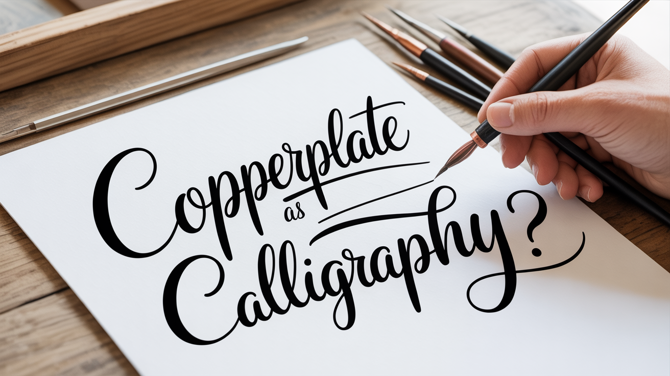
Copperplate is one of the most recognized calligraphy styles in the world. You have seen it on wedding invitations, vintage certificates, and formal correspondence. The letters are defined by a clear rhythm: thin, almost weightless upstrokes alternating with broad, ink-rich downstrokes. That contrast is what makes the style so striking, and it is also what makes it learnable, because the whole look comes from one repeatable action with a flexible pointed nib.
This guide explains what copperplate calligraphy is, where it came from, how the tool creates those distinctive strokes, and what a beginner needs to start.
At a Glance
- Copperplate is a pointed-pen script built from one mechanical principle: pressure spreads the nib's tines and thickens the line.
- It takes its name from 17th and 18th century copper-engraved copybooks, not from any copper-tipped pen.
- A starter kit is small: an oblique or straight holder, a beginner-friendly nib (Nikko G or Zebra G), smooth paper, and a well-behaved ink.
- The traditional slant is about 52 degrees from the baseline, close to the angle used in the related Spencerian hand.
- Legible letterforms are realistic within four to eight weeks of regular short practice sessions.
- Shaky strokes and occasional ink blobs are a normal part of early practice, not a sign you are doing it wrong.
A Brief History of Copperplate Script
Copperplate gets its name from the printing process, not from any copper-tipped pen. In the 17th and 18th centuries, engravers carved letter designs into copper plates, coated them with ink, and pressed paper against the plates to transfer text. The resulting letterforms were elegant and precise, and penmanship teachers of the era spent decades trying to replicate that look by hand.
The script that grew out of that effort is more precisely called English Roundhand, which took shape in England in the 1660s and spread rapidly after writing masters John Ayres and William Banson popularized it in the 1680s. The style reached what historians often call its golden age in the mid-18th century, driven in large part by George Bickham, whose compilation The Universal Penman (1733 to 1741) gathered work from twenty-five London writing masters and effectively standardized the look people now call copperplate. By the 19th century, that engraved ideal had settled into the closely related forms known as Engrosser's Script and Roundhand, and penmanship manuals built around them circulated widely enough that the style became a mark of educated handwriting well into the early 20th century, according to Wikipedia's overview of Copperplate script.
Today it is practiced as an art form rather than an everyday writing hand, which means you can learn it at your own pace, focused on the pleasure of the letters rather than functional speed.
How Copperplate Compares to Related Scripts
Copperplate did not develop in isolation. Knowing where it sits next to its closest cousins makes the terminology on nib packaging and practice sheets much less confusing.
| Script | Origin | Typical slant | Pressure style |
|---|---|---|---|
| Copperplate / Engrosser's Script | England, 17th to 18th c. engraved copybooks | ~52 degrees | Bolder, more deliberate thick strokes |
| English Roundhand | England, 1660s to 1680s | ~52 to 55 degrees | Foundation for copperplate's letterforms |
| Spencerian | United States, developed 1840 by Platt Rogers Spencer | ~52 degrees | Lighter, more oval-heavy, minimal shading |
How the Tool Makes the Strokes
Copperplate is written with a pointed nib inserted into a pen holder. Unlike calligraphy nibs that are cut at an angle (called broad-edge or chisel nibs), a pointed nib comes to a fine tip with two thin metal arms called tines. Those tines can spread apart under pressure, which is the entire mechanical secret of the style.
- Downstrokes: You apply gentle pressure as the pen moves down the page. The tines spread slightly, releasing more ink and creating a thicker line.
- Upstrokes: You release all extra pressure as the pen moves upward. The tines close, and the line becomes as thin as the nib allows.
The degree of flex in a nib describes how readily those tines spread. A nib with a lot of flex will produce dramatic thick-to-thin contrast; a stiffer nib gives a subtler contrast that beginners often find easier to control.
Because you are relying on controlled pressure rather than pen angle to create width, copperplate is written with the pen held at a shallower angle to the paper than you might expect, usually around 45 degrees or less.
What Beginners Need to Start
You do not need an expensive starter kit. The following four items are enough to begin.
Pen Holder
A basic oblique pen holder is the traditional choice for copperplate. The angled flange (the small metal arm that holds the nib) positions the nib to the right of the pen's center line, which makes it easier to hold the nib at the low angle copperplate requires. A straight holder also works, though it demands a bit more wrist rotation. Learn more about putting your first nib in place in our guide on how to assemble a dip pen and insert a nib.
Pointed Nib
A few nibs are popular starting points for copperplate beginners:
| Nib | Flexibility | Good for |
|---|---|---|
| Nikko G | Low-medium | Absolute beginners; very forgiving |
| Zebra G | Low-medium | Good control, widely available |
| Brause Steno (Blue Pumpkin) | Medium | More contrast once basics are comfortable |
| Gillott 303 | Medium-high | Finer lines, more expressive flex |
Start with a G nib (Nikko or Zebra). They are less prone to catching on paper fibers or spraying ink when you apply pressure.
New nibs come coated in a light factory oil that causes ink to bead up. Before your first use, pass the nib briefly through a flame or scrub it gently with a toothbrush and dish soap, then rinse. This removes the coating and lets ink flow evenly. Skipping this step is the single most common reason a brand-new nib feels scratchy or refuses to hold ink for a full stroke.
Ink
Black iron gall ink or a calligraphy-specific India ink works well for beginners. Avoid fountain pen inks, which are too thin and will bleed into most papers. The ink should flow smoothly but not drip off the nib the moment you lift the pen. See our step-by-step walkthrough on how to load ink onto a calligraphy nib if the loading process feels uncertain.
Paper
Paper quality matters more than most beginners expect. Smooth, sized paper lets the nib glide without snagging. Good starting options include:
- Rhodia pads (grid or dot grid)
- Clairefontaine notebooks
- HP Premium 32 lb printer paper (inexpensive and surprisingly reliable)
Avoid textured watercolor paper, regular printer paper, or any surface described as "toothy." The tines of a pointed nib will catch and spray ink on rough surfaces.
The Basic Strokes of Copperplate
Copperplate letters are built from a short set of component strokes rather than learned letter by letter. Drilling these strokes before attempting full letterforms accelerates progress significantly.
The core strokes are:
- Overturn - A curved upstroke that arches at the top, like an upside-down U. No pressure on the way up; light exit pressure as you curve over.
- Underturn - A curved downstroke that curves at the bottom, like a U. Pressure on the way down; release at the base of the curve.
- Compound curve - An overturn followed immediately by an underturn. The letter n is built from this stroke.
- Oval - A consistent egg-shaped form that the letters a, d, g, o, and q all share. Keeping ovals consistent is one of the core challenges of the script.
- Ascending and descending loops - The tall strokes in letters like l, h, f, and g.
The relationship between upstrokes and downstrokes is explained in detail in our guide on thin upstrokes and thick downstrokes, which covers both the technique and the common pressure mistakes that cause ink blobs or scratchy lines.
What to Expect in Your First Weeks
Early copperplate practice rarely looks like the polished examples in books, and that is completely normal. A few realistic expectations help beginners stay on track.
Shaky strokes are standard. Your hand is learning a new kind of fine motor control. The shakiness usually fades within a few weeks of consistent short sessions (15 to 20 minutes at a time is plenty; longer sessions often lead to fatigue and bad habits).
Ink blobs happen. They usually mean too much ink on the nib, too much pressure, or paper that is slightly damp from humidity. Dip the nib, blot it lightly on the edge of the ink jar, and try again.
The oblique holder feels awkward at first. Most beginners grip it like a regular pen. Loosen your grip, let the holder rest lightly in the webbing between thumb and finger, and let the elbow rather than the wrist do most of the movement on longer strokes.
Progress is not linear. A worked example: a beginner practicing three 20-minute sessions a week typically produces recognizable individual letters by week two or three, connected words with reasonably even slant by week five or six, and a full line of steady practice text somewhere between week seven and week ten. Plateaus in the middle of that range are common and do not mean you have stalled; they usually resolve with one or two more weeks of the same steady repetition.
Consistent short practice sessions, spaced regularly, build the muscle memory faster than occasional long sessions.
Frequently Asked Questions
Do I need calligraphy experience before learning copperplate? No. Copperplate is often the first pointed-pen style beginners learn. If you have done faux calligraphy with a regular pen, you already understand the visual logic of thick downstrokes and thin upstrokes. That background is helpful but not required.
How is copperplate different from Spencerian script? Both are pointed-pen scripts developed from a shared writing-master tradition, but Spencerian is lighter and more oval-heavy, with very little flex pressure used and shading dropped from letters like i, t, and p. Copperplate tends to use more pressure and produce bolder thick strokes. Spencerian was developed in 1840 by Platt Rogers Spencer as a practical everyday hand and became the American standard for business correspondence for roughly seventy years; copperplate is more formal and stayed closer to its engraved-copybook roots. Many penmanship books treat them as related cousins within the same tradition.
Can I learn copperplate with a brush pen instead of a dip pen? Some brush pens with fine, flexible tips can approximate copperplate-style contrast, but the result is not true copperplate. The pointed dip pen is central to the script because the spreading tines produce precise, controlled line variation that brush tips do not replicate the same way. For brush-specific lettering, modern brush lettering is a distinct style worth exploring separately.
How long does it take to write recognizable copperplate letters? Most beginners can produce legible, recognizably copperplate letterforms within four to eight weeks of regular practice, about three or four sessions per week. Polished, consistent letters take longer, but the early progress is visible and encouraging.
What slant angle should I use? Traditional copperplate uses a consistent slant of approximately 52 degrees from the horizontal baseline (or 38 degrees from vertical), the same angle historically associated with Roundhand and later carried into Spencerian practice. Many practice sheets include slant guidelines printed at this angle. Using a slant guide in your first weeks builds the habit before you try to maintain it freehand.
Why does the same script get called Copperplate, Roundhand, and Engrosser's Script? The names reflect different angles on the same tradition rather than three separate scripts. Roundhand is the broader English style that emerged in the 1660s to 1680s; copperplate describes the look those letters took on once they were engraved into copybooks for reproduction; Engrosser's Script is the more formal, heavily shaded variant used for certificates and formal documents. In casual use today, most people use the three terms interchangeably to mean the same pointed-pen family of letterforms.