Tools & Supplies
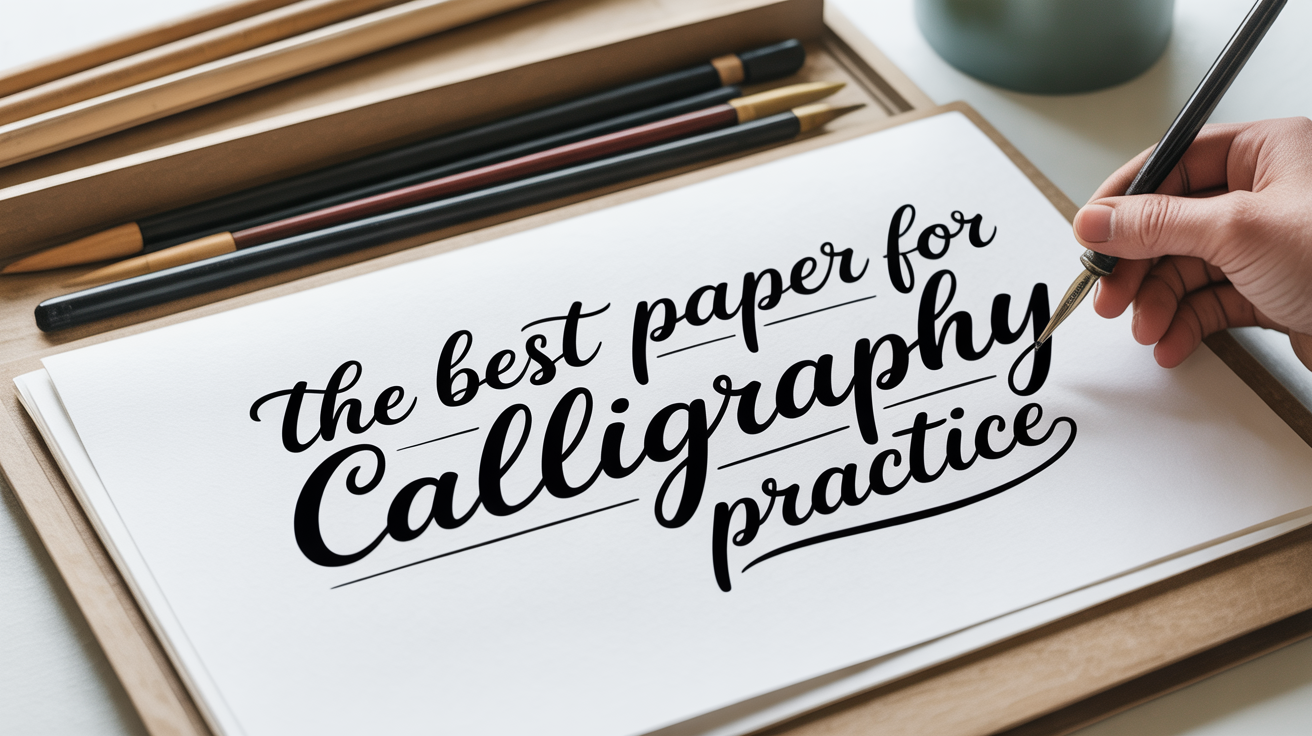
The Best Paper for Calligraphy Practice
Learn what makes paper work for calligraphy: GSM, smoothness, bleed-resistance, and sizing explained for beginners.
Paper matters more than most beginners expect. You can have a good nib and good ink, and still end up with fuzzy edges and blotchy strokes if the paper is wrong. The good news: you do not need expensive specialty paper from the start. You need paper that is smooth enough to let the nib glide, heavy enough not to buckle when wet, and sized (coated internally) to resist bleed-through.
This guide explains the qualities to look for, the main categories of calligraphy practice paper, and when to move up to better stock.
What the Key Terms Mean
GSM stands for grams per square metre. It is a measure of paper weight. Standard printer paper is around 75-80 GSM. Calligraphy paper tends to run 90-120 GSM for everyday practice and 160+ GSM for finished pieces. Heavier paper absorbs ink more slowly, which gives you more control and reduces buckling.
Sizing is a treatment applied to paper to control how it absorbs liquid. Paper with good sizing keeps ink sitting on or near the surface rather than soaking straight in. Unsized or "waterleaf" paper drinks ink immediately, causing feathering.
Feathering is what happens when ink spreads along the paper's fibres, creating ragged, fuzzy edges instead of clean lines. It is the enemy of crisp hairlines.
Bleed refers to ink soaking through to the back of the sheet. Even if the front looks fine, bleed makes double-sided work impossible and can transfer to whatever is underneath.
Tooth describes the texture of a paper's surface. A paper with a lot of tooth has visible texture (think watercolour paper). For pointed-pen calligraphy, you want very low tooth so the nib can flex and travel smoothly without catching. Brush pens tolerate a little more texture.
The Paper Categories Worth Knowing
Smooth Practice Paper (Laser/Inkjet Stock)
Standard copy paper is often recommended for first drills, and it works in a pinch, but it feathers with most inks and the thin weight means bleed-through is common. A better starting option is smooth laser-jet paper rated at 90-100 GSM with a bright, high-smoothness finish. These are widely available and inexpensive.
Look for papers marketed as "premium multipurpose" or "presentation" stock rather than basic copy paper. The smoothness rating is sometimes listed on the packaging. If the packaging says nothing, the paper is likely standard copy stock.
Marker Paper and Layout Pads
Layout pads and marker papers are designed to be non-absorbent so ink stays crisp. They handle water-based inks well and show hairlines cleanly. They are thin (often 70-75 GSM), which means bleed-through onto the sheet below is possible, but the smoothness is excellent for practice. Use these when you want to drill letterforms and see your strokes clearly without worrying about ink pooling.
Rhodia-Style Grid and Dot Pads
Pads with a slight sheen and a grid or dot pattern underneath are popular with calligraphers for a reason: the surface is silky, the GSM is usually adequate for most inks, and the grid or dots let you work at consistent slant and x-height without drawing guidelines by hand. The paper in this category tends to resist feathering well. When you want a clean reference for spacing and angle, this type of pad is worth having.
Tracing Paper
Tracing paper has zero tooth and almost no absorbency, which makes it very forgiving with pointed-pen nibs. It is also translucent, so you can place guidelines underneath and see them through the sheet. The downside is that it is fragile when wet, it wrinkles easily, and finished work looks dull on it. Use it for warm-up drills where you want the smoothest possible surface, not for anything you intend to keep.
Specialty Calligraphy and Lettering Paper
Paper sold specifically for calligraphy is usually sized, moderately heavy (100-120 GSM), and tested to perform well with both iron gall and india ink. It costs more per sheet than the options above but produces noticeably crisper work. If you are addressing envelopes, doing a finished quote for framing, or practicing with gouache, this is worth the step up.
Hot-Press Watercolour Paper
Hot-press means the paper surface was pressed smooth with heat during manufacture, unlike cold-press which has visible texture. Hot-press watercolour paper at 200+ GSM handles wet media including gouache and diluted acrylic inks without warping, and the surface is smooth enough for pointed-pen work. It is the choice when you want to combine calligraphy with a painted background or use heavy pigmented inks on a final piece.
A Quick Comparison of Paper Qualities
| Category | Typical GSM | Surface | Best for |
|---|---|---|---|
| Standard copy paper | 75-80 | Medium | Emergency drills only |
| Smooth laser/inkjet stock | 90-100 | Smooth | Daily practice |
| Marker/layout pad | 70-75 | Very smooth | Drill sessions, ink testing |
| Coated grid/dot pads | 80-90 | Smooth/semi-glossy | Practice with guidelines |
| Tracing paper | 40-60 | Extremely smooth | Warm-ups, slant drills |
| Specialty calligraphy paper | 100-120 | Smooth, sized | Practice + finished work |
| Hot-press watercolour paper | 200-300 | Smooth, heavy | Final pieces, gouache |
When to Move Up from Practice Stock
Beginners often stay on cheap paper longer than they should, and that is fine during the alphabet-drilling stage. The moment to switch to better paper is when your basic letterforms are consistent. If you are still getting gaps and wobbles in every letter, the paper is not the problem. But once your strokes are reasonably controlled and you are still seeing fuzzy edges and ink spreading, better paper will make a visible difference.
A good rule: keep inexpensive smooth paper for drills where you fill a page with a single letter or stroke. Move to better stock when you are practicing whole words, working on spacing, or doing anything you might want to photograph.
Getting your nib setup right helps here too. If you are not sure which nib suits your current stage, calligraphy nibs explained: a beginner's guide covers the main types and how they behave on different surfaces. And if you are still deciding between a straight holder and an oblique holder, straight vs oblique pen holders: which to choose explains the difference. If you want a full starting list before picking individual supplies, the best calligraphy starter kit: what you actually need walks through what to buy first.
Paper for Brush Pens vs. Pointed Pen
Brush pens and pointed dip pens have different needs. Brush pens flex more and cover more surface area, so they work on a slightly wider range of papers. They tolerate a little tooth and are less likely to catch on surface texture.
Pointed nibs are more sensitive. A rough or textured surface will catch the tine tips, cause ink to spray, and wear the nib faster. If you use both tools, keep a separate pad for each, or test a new paper with brush pens first before using it with a pointed nib.
Ink type also interacts with paper. Iron gall ink is thin and tends to feather more on unsized stock. India ink and acrylic-based inks are thicker and more forgiving on moderate-quality paper. Gouache needs heavier paper that will not buckle.
Frequently Asked Questions
Can I use regular printer paper for calligraphy practice? You can, but standard 75-80 GSM copy paper feathers with most inks and bleeds through easily. It works for rough drills where you are just learning pen hold or basic strokes. For any practice where you want to see clean hairlines, upgrading to 90+ GSM smooth paper makes a real difference.
What GSM paper is best for calligraphy beginners? For daily practice, 90-100 GSM smooth paper covers most situations. For finished pieces or work with gouache and heavy inks, 120-200+ GSM is more appropriate. Below 90 GSM, bleed-through and buckling become likely with any ink that is not extremely thin.
Why does my ink feather on some papers but not others? Feathering happens when ink soaks into the paper's fibres rather than sitting on the surface. Papers with good internal sizing resist this. Papers made for writing or printing often have sizing; cheap copy paper and uncoated stock often do not. The ink type matters too: thin, water-based inks feather more readily than thicker pigmented inks.
Does the color of the paper matter? For practice, not really. White or off-white paper makes it easier to see ink contrast and judge letterform quality. For finished work, cream or tinted papers can look elegant, but make sure the surface is smooth and sized regardless of colour.
Is there a difference between calligraphy paper and regular writing paper? Yes. Calligraphy paper is typically heavier, has a smoother surface, and is sized specifically to handle the volume of ink a nib or brush pen deposits. Standard writing paper works fine with a ballpoint or felt-tip but often feathers badly with calligraphy inks, especially iron gall or diluted india ink.