Brush Lettering
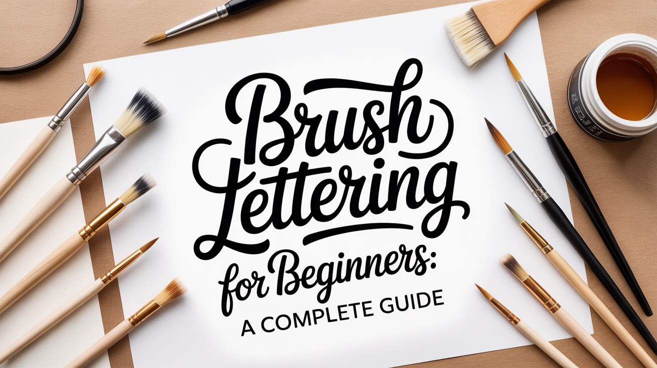
Brush Lettering for Beginners: A Complete Guide
Learn brush lettering from scratch. Covers tools, basic strokes, letter formation, and practice tips for true beginners.
Brush lettering is the practice of forming letters with a flexible, pointed brush or brush pen, using variation in pressure to create thick and thin strokes within a single letterform. It looks complicated from a distance, but the underlying mechanic is simple: press down for thick strokes, lift slightly for thin ones. Once that clicks, the rest is just patient repetition.
This guide covers everything you need to get started, from choosing your first tools to forming connected letters and troubleshooting the wobbles that trip up almost every beginner.
What You Need to Get Started
You do not need an expensive kit to begin. A small brush pen, a smooth pad of paper, and a printable practice sheet are enough for your first several sessions.
Brush Pens vs. Pointed Brushes
Most beginners start with brush pens rather than traditional pointed brushes loaded with ink. Brush pens have a self-contained ink reservoir, so there is no dipping, no ink pooling, and no mess. They come in two main tip styles:
- Soft flexible tips, these mimic the feel of a real brush and respond well to pressure changes. They are ideal for the thick-thin contrast that defines brush lettering.
- Firm chisel or bullet tips, more like a marker; less pressure response; better for block lettering than calligraphy-style scripts.
For brush lettering specifically, you want a soft, flexible tip. Look for pens labeled "brush" or "flex" rather than "marker."
Tip size matters too. A small-tip brush pen (roughly 1–3 mm at the tip) gives you more control over letterforms, which is exactly what a beginner needs. Large brush pens (5 mm and up) are rewarding once you understand how pressure works, but they amplify every wobble early on. Start small.
If you eventually want to work with a traditional pointed brush and bottled ink, a size 2 or 3 round watercolor or calligraphy brush is a reasonable starting point. Look for a tip that snaps back to a fine point when wet.
Paper
Paper is more important than most beginners expect. Rough or textured surfaces fray soft brush tips quickly and create ragged strokes. Smooth, coated, or slightly calendered surfaces let the tip glide and produce clean lines.
Good starting options:
- Smooth copy paper (the cheap stuff works fine for drills)
- Hot-press watercolor paper (smooth surface, handles wet ink without buckling)
- Marker or brush lettering paper pads (specifically designed not to bleed)
Avoid standard mixed-media pads or watercolor pads labeled "cold-press", the texture is too rough for a brush pen tip.
A Quick Supply Checklist
| Item | What to look for | Priority |
|---|---|---|
| Brush pen (small tip) | Soft, flexible tip; self-contained ink | Essential |
| Smooth paper | Marker pad or hot-press; 70–90 lb weight | Essential |
| Pencil and ruler | For drawing guideline grids | Helpful |
| Practice sheets | Printable letter drills | Helpful |
| Large brush pen | 5 mm+ soft tip | Later |
| Traditional pointed brush | Size 2–3 round, snap-back tip | Optional |
| Bottled calligraphy ink | Pigment-based, non-waterproof for brushes | Optional |
The Pressure Mechanic: How Brush Lettering Actually Works
This is the core concept. Understanding it early saves a lot of frustration.
In brush lettering, the thickness of a stroke is controlled entirely by how much pressure you apply to the brush tip:
- Downstrokes (moving toward you, downward on the page) use heavy pressure. The tip splays open and lays down a wide, thick line.
- Upstrokes (moving away from you, upward on the page) use light pressure. You barely touch the surface, and the tip makes a thin, hairline mark.
Every letter in brush lettering is built from these two stroke types. The transitions between them, where the brush shifts from heavy to light or light to heavy, are what create that characteristic fluid look.
A good way to feel this before you form any letters: draw simple oval shapes, alternating heavy pressure on the left side and light pressure on the right. You are not going for perfect ovals. You are just training your hand to change pressure mid-stroke.
Shaky lines are completely normal at first. The brush pen tip is more sensitive than a ballpoint pen, and your hand is not used to modulating pressure while also guiding direction. The shakiness fades with repetition.
Basic Strokes: The Building Blocks of Every Letter
Before you write any letters, practice the individual strokes that letters are made of. This is called drill practice, and it is the fastest way to build muscle memory. You can find a full breakdown in our guide to the basic strokes of brush lettering.
Here are the six strokes worth mastering first:
- Underturn, starts with a downstroke (heavy), curves at the bottom, then exits upward (light). Forms the base of letters like u, w, and n.
- Overturn, starts with an upstroke (light), curves at the top, then exits downward (heavy). Forms the arch of m, h, and n.
- Oval, a closed ellipse shape with heavy pressure on the left curve and light on the right. Forms the body of a, d, g, o, q, and c.
- Compound curve, a full S-shaped stroke that combines an overturn into an underturn. Used in letters like s and z.
- Ascending loop, a tall, looping upstroke that connects to a downstroke. Used in b, h, k, and l.
- Descending loop, a downstroke that loops below the baseline and sweeps back up. Used in g, j, p, q, and y.
Practice each stroke in rows across your page before moving to letters. Ten minutes of stroke drills every day produces faster improvement than an hour of irregular practice.
Understanding the Guidelines
Most brush lettering practice sheets include four horizontal lines:
- Ascender line, the ceiling for tall letters like h, l, b
- Cap height, where capital letters typically end
- Waist line (x-height), the top of small letters like a, o, e
- Baseline, where letters sit
- Descender line, the floor for letters with tails like g, y, p
The space between the baseline and waist line is called the x-height. Keeping your letters consistent within this zone is one of the simplest ways to make your lettering look more polished, even before your strokes are perfectly smooth.
How to Form Letters
Once your basic strokes feel somewhat predictable, it is time to put them together into letters. The modern brush lettering alphabet is not written the same way you learned to print or write cursive in school. Each letter is essentially an assembly of the strokes you have already practiced.
A Suggested Letter Order
Rather than going A to Z, group letters by the strokes they share:
Oval-family first: a, d, g, o, q, c, e, these all start with or include an oval shape.
Underturn-family: u, w, n, smooth the underturn stroke and these three come easily.
Overturn-family: m, h, r, the arch stroke applied repeatedly.
Loop-family: b, l, k, h, f, ascending loops plus a downstroke.
Descender-family: g, y, p, j, q, descending loops that dip below the baseline.
Diagonal-family: v, x, z, w, these use diagonal strokes rather than the classic oval/turn shapes.
Practice each letter in isolation before connecting it to others. Within each letter, slow down at the transitions where pressure changes, those are the moments beginners tend to rush.
Connecting Letters
Modern brush lettering is typically written as a connected script, similar to cursive but more stylized. The connections happen on the upstrokes: the thin exit stroke of one letter flows directly into the entry stroke of the next.
The most common connection mistake is lifting the pen between letters and then starting the next letter with a new downstroke. This creates a gap or a double-thick entry. Instead, keep the thin upstroke moving smoothly off the page and into the beginning of the following letter.
Some letter pairs are harder to connect than others. The letters o, r, v, and w have exit points that do not flow naturally into certain followers. For now, it is fine to lift and reposition slightly on awkward pairs, rather than forcing an unnatural connection.
Developing Your Style: Modern Brush Lettering
Modern brush lettering refers to a looser, more expressive interpretation of the traditional pointed-pen scripts. It differs from classical copperplate or Spencerian calligraphy (which follow strict slant angles and proportions) in that modern brush lettering allows for personal variation in letter height, slope, and bounce.
A few characteristics that define the modern look:
- Bounce lettering, letters deliberately sit at slightly different heights along the baseline, giving a playful, informal feel.
- Extended loops, ascenders and descenders are stretched longer than traditional proportions.
- Simplified connections, not every letter needs to connect; strategic lifts add rhythm.
- Mixed case, combining capitals and lowercase in non-standard ways for visual interest.
You do not need to chase a specific style at the beginning. Work on consistent pressure control and proportions first. Style develops naturally as you log more hours of practice. Trying to copy someone else's bounce or letter shapes before your fundamentals are solid usually leads to frustration.
For ideas on what to do with brush pens once you are comfortable with letter formation, see our guide on how to blend colors with brush pens for ombre lettering. That technique works best once pressure control feels reliable.
Common Problems and How to Fix Them
| Problem | Likely cause | Fix |
|---|---|---|
| Strokes are all the same thickness | Not varying pressure | Practice isolated downstrokes and upstrokes; exaggerate the difference |
| Tip is fraying quickly | Paper is too rough, or pressure is too heavy | Switch to smoother paper; reduce pressure on upstrokes |
| Letters look shaky and uneven | Normal in early practice; also happens when writing too fast | Slow down significantly; shakiness usually improves after 2–3 weeks |
| Ink skips on upstrokes | Tip drying out, or upstroke pressure too light | Re-cap pen between sessions; try slightly more tip contact on upstrokes |
| Letters lean at inconsistent angles | No slant guide | Draw or print a slant guideline (45–55 degrees is common for modern scripts) |
| Connections look clunky | Lifting pen between letters and restarting | Practice the exit upstroke of each letter in isolation, then add the entry of the next |
One thing worth saying directly: brush lettering looks harder than it is in the first week and easier than it seems after the first month. Almost everyone goes through a phase of thinking their strokes look terrible compared to what they see online. That gap is normal. The people posting polished work have months or years of drills behind them, not innate talent.
Building a Practice Routine
Consistency matters more than session length. Twenty minutes three times a week will produce faster improvement than a two-hour session once a week.
A simple session structure:
- Warm up with drills (5 minutes). Fill a line or two with underturns, overturns, and ovals. This gets your hand calibrated before you attempt letterforms.
- Practice one letter group (10 minutes). Pick two or three letters and write them in rows. Focus on pressure transitions, not speed.
- Write a word or short phrase (5 minutes). Apply what you just practiced in context. This is also where you work on connections.
If you are unsure which pen size to move to as you improve, the guide on small vs. large brush pens covers the tradeoffs in detail.
Frequently Asked Questions
Do I need to know cursive to learn brush lettering?
No. Brush lettering is its own system of strokes and connections, and you learn it from scratch regardless of your handwriting background. People with no cursive experience often pick it up just as quickly as those who write cursive regularly, sometimes faster because they have fewer habits to unlearn.
How long does it take to get decent at brush lettering?
Most people can form recognizable, reasonably consistent letters within two to four weeks of regular practice (three or more sessions per week). Writing words fluently with smooth connections typically takes one to three months. "Decent" is a moving target, but you will likely feel a real sense of progress within the first month.
Can I use any brush pen for brush lettering?
Not all brush pens are equal. Pens with a stiff tip behave more like a marker and do not produce the thick-thin stroke variation that defines brush lettering. You need a soft, flexible tip that responds to pressure changes. If your strokes all look the same width no matter how you press, the tip is probably too firm.
Why does my brush pen tip fray so quickly?
The two most common causes are paper texture and excess pressure. Rough paper acts like sandpaper on a soft tip. Pressing too hard on upstrokes also splays the tip sideways, which deforms it over time. Use smooth paper and keep upstroke pressure light: the tip should barely touch the surface.
Is there a difference between brush lettering and calligraphy?
These terms overlap and are sometimes used interchangeably, but there is a loose distinction. Traditional calligraphy usually refers to scripts written with a rigid or semi-rigid nib (a metal point attached to a pen holder) using ink, with strict proportional rules. Brush lettering refers to scripts written with a soft brush or brush pen, with more room for personal style. Both use pressure variation to create thick and thin strokes. If you are starting out and trying to decide between the two, brush pens are generally more forgiving to learn with than metal nibs.