Brush Lettering
How to Blend Colors With Brush Pens (Ombré Lettering)
Learn brush pen blending step by step. Two methods for smooth ombré lettering, plus which colors work best and how to fix streaky results.
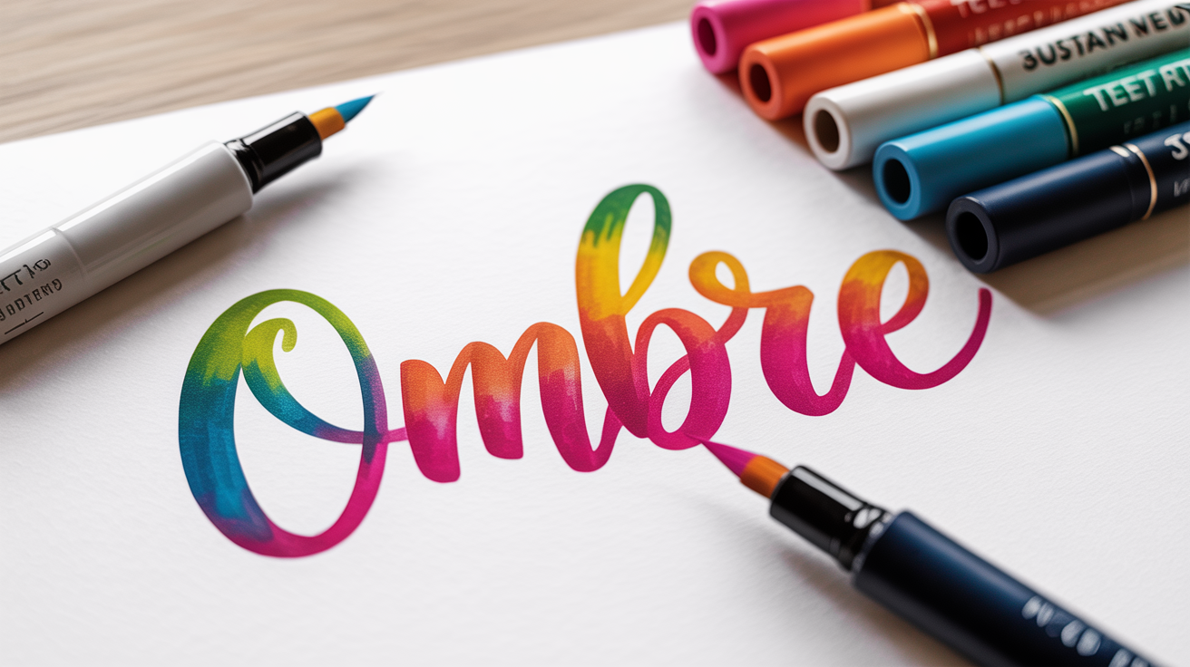
Blending brush pens sounds complicated, but the basic idea is simple: you overlap two or more colors while the ink is still wet, and they merge into a smooth gradient. That gradient is called an ombré (French for "shaded"), and it's what gives hand lettering those seamless color transitions you see all over social media.
This guide walks you through two reliable blending methods, tip-to-tip and palette blending, with clear steps for each. You do not need any special equipment to start; a few brush pens and a smooth piece of paper are enough. If you are still building your foundation strokes, the guides on brush lettering for beginners and the basic strokes of brush lettering will help you feel more confident before you add color mixing into the mix.
What You Need Before You Blend
Getting smooth color blends depends less on technique and more on using the right materials. Cheap paper and incompatible ink types will fight you no matter how careful you are.
Pens and ink
Brush pen blending works best with water-based dye inks. Dye inks stay wet long enough to blend, and two water-based pens from the same brand (or the same ink chemistry) will almost always mix well together. Pigment-based inks dry faster and may not blend at all, check the label before you try.
Twin-tip brush pens (which have a flexible brush nib on one end and a fine-tip nib on the other) are especially handy here because you can use one end for lettering and the other to transfer ink to a palette. Single-tip pens work fine too.
Paper
Smooth, non-porous paper slows ink absorption and gives you a wider blending window. Look for:
- HP Premium 32 lb (a printer paper with almost no tooth)
- Rhodia dot or lined pads
- Marker paper labeled "bleed-proof"
Regular copy paper is too absorbent, the ink sinks in before you can blend it.
Color choices
High contrast color pairs (like yellow-to-dark-purple) tend to produce a muddy middle zone. For clean ombré lettering, start with adjacent colors on the color wheel:
| Pair | Result |
|---|---|
| Yellow + orange | Warm gradient, easy to blend |
| Pink + purple | Classic, smooth transition |
| Teal + blue | Cool and fresh, very forgiving |
| Coral + magenta | Vibrant, medium difficulty |
| Green + yellow | Fresh, beginner-friendly |
Once you get comfortable, you can push further apart on the wheel. For now, stick to neighbors.
Method 1: Tip-to-Tip Blending
Tip-to-tip blending means you touch the tip of one pen directly to the tip of another. Ink transfers from one nib to the other, and when you letter with the receiving pen, both colors appear in the stroke.
Step-by-step:
- Choose your two pens. Uncap both so they are ready.
- Hold your lighter-color pen pointing upward (vertically). This is the pen you will letter with.
- Press the darker pen's tip lightly against the lighter pen's tip for about two seconds. You will see the darker color travel a short way into the lighter pen's nib.
- Immediately put the darker pen aside and use the lighter pen to letter your word or phrase. The dark ink is at the very tip; the lighter color follows behind it.
- Work quickly. Once the transferred ink dries, the gradient ends.
- To extend the blend or repeat the effect, touch the tips together again.
A few things to watch for:
- If too much dark ink transfers, the first stroke or two will look solid dark. Scribble on scrap paper until the lighter color starts showing through again.
- The more you press the tips together, the more dark ink transfers. A light touch gives a shorter gradient; a longer press gives a longer one.
- Keep a scrap sheet next to your work to test the color before committing to your final piece.
This method is fast and direct, which makes it good for short words or single letters. For longer phrases, palette blending gives you more control.
Method 2: Palette Blending
A blending palette (also called a mixing palette) is just a smooth, non-absorbent surface where you deposit and mix ink before applying it. An acrylic craft tile, the glossy back of a sticker sheet, or even a piece of parchment paper all work. The goal is to build a gradient zone outside the pen itself, then pick it up with a colorless blender pen or a lightly inked brush.
Step-by-step:
- Scribble a patch of your lighter color onto the palette surface. Make it about an inch wide.
- Scribble a patch of your darker color next to the first patch, overlapping by about a quarter inch in the middle. The overlap zone is where they will mix.
- Use a colorless blender pen (a pen filled with clear, water-based fluid rather than colored ink) to blend the overlap zone. Stroke gently into the lighter color, pulling the dark ink toward it. Then reverse direction, pulling light ink into the dark patch. The blender pen carries color without adding new pigment.
- Once you have a smooth gradient on the palette, load your lettering pen (the lighter-color pen, uncapped) by pressing its tip gently into different zones of the palette gradient. The tip picks up the mixed color.
- Letter immediately. The gradient will appear in your strokes.
This method takes a minute to set up, but it gives you a more predictable, repeatable result. If the palette dries out, re-scribble and blend again.
No blender pen? You can sometimes use a damp fine-tip pen or a water brush (a brush pen with a water reservoir instead of ink) to do the same job. Just be aware that too much water dilutes the ink and can leave the color looking washed out.
Writing the Letters
Blending looks most dramatic on thick downstrokes because that is where the ink pools. If you are not sure what a downstroke is, it is simply any stroke you make while moving the pen toward you, pressing down on the brush nib to make the line wide. The basic strokes of brush lettering covers this in detail if you want a refresher.
A few tips for the best gradient effect:
- Write large. Blending is hard to see in letters smaller than an inch tall. Start with letters at least 1.5 to 2 inches high.
- Keep your strokes slow and deliberate. Rushing pushes ink unevenly.
- Write each letter fully before moving to the next. If you letter a whole word lightly and then go back to add weight, the blending window has already closed.
- If the gradient is barely visible, increase the contrast between your two colors. Sometimes a pale yellow and a pale green look nearly identical when lettered.
Streaky results are normal at first. Ink, paper, and pen tips all behave a little differently, and it takes a few sessions to learn how quickly your particular pens blend. Do not throw away your early attempts, hold them next to a light source and you will often see the gradient more clearly than you expected.
Troubleshooting Common Problems
| Problem | Likely cause | Fix |
|---|---|---|
| Colors turn muddy or brown | Pens are not compatible or colors are too opposite | Stick to adjacent colors; try pens from the same brand |
| No blending at all | Paper too absorbent, or pigment ink used | Switch to marker or photo paper; check ink type |
| Gradient disappears too fast | Ink dries quickly in low humidity | Work faster; try palette method for more control |
| Too much dark color at the start | Over-transferred with tip-to-tip | Scribble on scrap paper first; try a lighter touch |
| Tip-to-tip ruined the darker pen | Pressed too long, light ink flooded dark pen | Scribble the dark pen on scrap until the original color returns |
Pen nibs that have absorbed a foreign color usually recover after a minute of scribbling on scrap. If a nib seems permanently stained, cap the pen and try again the next day, sometimes the ink re-homogenizes inside the barrel.
Choosing the right pen size also affects how visible your blending looks. Larger nibs carry more ink and blend more visibly; small pens work better for detail but can make gradients harder to see. The guide on small vs large brush pens explains the size tradeoffs if you are trying to decide which pens to buy.
Frequently Asked Questions
Do I need special blending brush pens, or will any brush pen work?
Any water-based brush pen can blend with another water-based pen of similar ink chemistry. You do not need pens marketed specifically as "blendable." The most reliable results come from using pens from the same brand and product line because the ink formulas are designed to be compatible. Cross-brand blending sometimes works beautifully, and sometimes the colors fight each other, so always test on scrap paper first.
Why does my blended lettering look streaky instead of smooth?
Streaks usually mean one of three things: the ink dried too fast before you finished the letter, the paper absorbed the ink unevenly, or you pressed too hard and the nib dragged instead of gliding. Try smoother paper, work a little faster, and use slightly less pressure. A single slow, deliberate stroke often blends better than several quick ones.
Can I blend more than two colors?
Yes. Three-color gradients are common (for example, yellow to orange to pink). The trick is to work light to dark, blending each adjacent pair while the ink is still wet. The palette method works better for three colors than tip-to-tip, because it gives you a staging area to build the full gradient before you letter.
How do I keep the gradient consistent across a whole word?
This is the hardest part of brush pen blending for beginners. One approach: letter each downstroke individually and blend between strokes, rather than trying to maintain a consistent gradient through a whole connected word. Another approach is to plan which letter gets which color zone before you start, so you know that the first two letters are light, the middle letter spans the transition, and the last two are dark.
My blender pen is turning dark from picking up ink. Is that a problem?
Not really. Colorless blender pens do accumulate color on the tip from repeated use. As long as you are working in the same color family, this usually does not affect your work. If you shift to a completely different color palette, scribble the blender on scrap paper until it runs clear again. Some artists keep two blender pens: one for warm tones and one for cool tones.