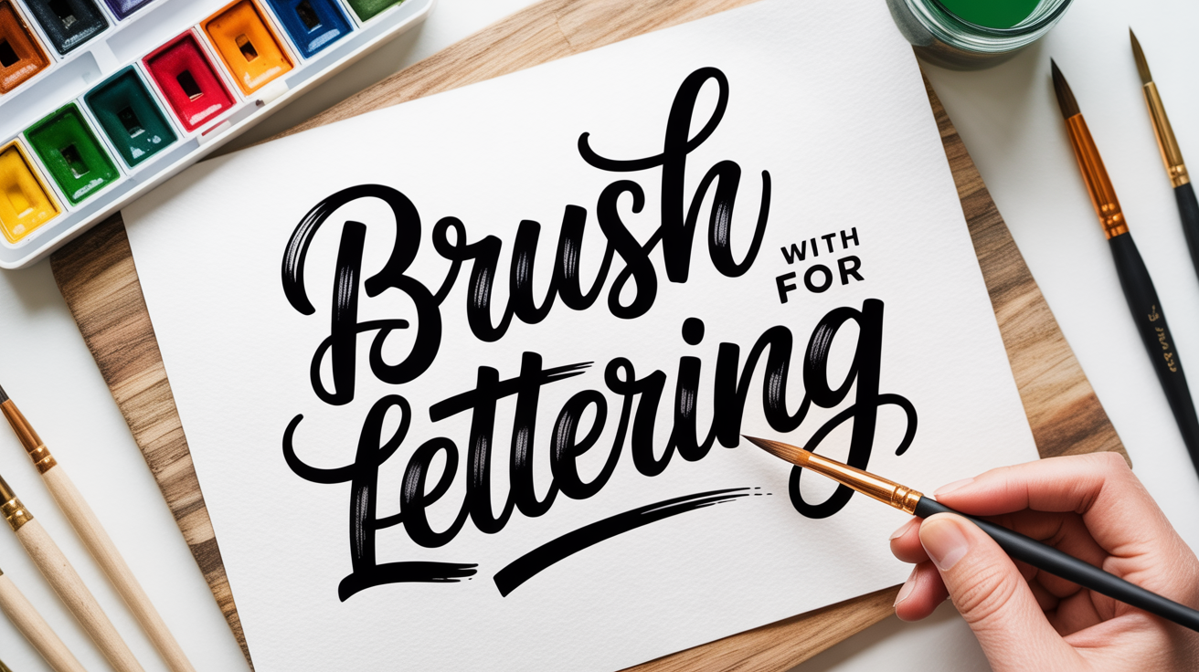
Brush Lettering
Brush Lettering With a Watercolor Brush for Beginners
Learn watercolor brush lettering from scratch: brush setup, paint consistency, thin upstrokes, thick downstrokes, and color blending for beginners.
You do not need a brush pen to do brush lettering. A round watercolor brush loaded with paint works on the same principle: light pressure on the upstroke, heavier pressure on the downstroke. The result is a style that looks a little looser and more painterly than what you get with a firm brush pen, and that quality is part of the appeal.
This guide covers everything a beginner needs to get started with watercolor brush calligraphy: choosing a brush, mixing paint to the right consistency, building stroke control, and blending colors once the basics are solid. Expect wobbly strokes at first. They straighten out with practice, and they are not a sign that something is wrong.
Choosing the Right Brush
For lettering with a paintbrush, a round brush is the standard choice. Round brushes come to a fine point at the tip. The widest part of the bristles is called the belly, and the metal band that holds the bristles to the handle is the ferrule.
For beginners, a size 4 or 6 round brush hits a good balance. A size 2 is too small and tiring to control for long sessions. A size 8 or 10 is large enough that the stroke variation is dramatic, which sounds appealing but requires more pressure sensitivity than most beginners have developed yet.
Look for:
- Synthetic rounds labeled "lettering" or "watercolor" - These hold a point well and snap back after pressure, which matters for upstrokes.
- A brush with a good belly - The belly holds the paint reservoir. A brush with very little belly will run dry mid-letter.
- Avoid flat brushes and fan brushes - They do not taper to a point and will not produce a thin upstroke.
You do not need an expensive sable brush to learn on. A mid-range synthetic round in the $6 to $12 range is fine for practice.
Mixing Paint to the Right Consistency
Paint consistency is where most beginners run into trouble with watercolor lettering for beginners. Too thin and the paint spreads and bleeds. Too thick and it drags, skips, and clogs the tip.
The target consistency is often described as "heavy cream" or "whole milk." Here is how to dial it in:
- Squeeze a small amount of tube watercolor or gouache onto a palette. Tube paint is easier to control than pan watercolor for this purpose because you can mix it to a precise thickness.
- Add water one small drop at a time and mix with a clean brush or palette knife.
- Test by loading your brush and making a slow downstroke on scrap paper. The paint should flow smoothly without puddling or dragging.
- If the paint bleeds into the paper fibers and spreads past where you put it, add a little more paint to thicken the mix.
- If the stroke looks scratchy or the bristles skip, add a small drop of water and retest.
Gouache is popular for watercolor brush calligraphy because it dries opaque and can be rewetted if it thickens on the palette. Watercolor dries more translucent, which suits blending techniques but requires slightly more attention to consistency.
How to Load the Brush and Make Your First Strokes
Loading properly sets up every stroke before you touch the paper.
- Dip just the belly and tip into the paint, not the entire bristle length up to the ferrule. Paint near the ferrule is hard to control and can split the tip.
- Wipe one side of the brush lightly on the palette edge to remove excess and re-form the point.
- Hold the brush at roughly a 45-degree angle to the paper surface, not perfectly upright. An upright brush gives you less belly contact and less stroke variation.
- Practice a thin upstroke first: apply very light pressure so only the tip of the brush touches the paper and draw the brush upward. This stroke should be thin and consistent.
- Practice a thick downstroke: apply firm, even pressure so the belly presses into the paper and pull downward. The stroke should be noticeably wider than the upstroke.
The difference between thin upstrokes and thick downstrokes is the defining feature of brush lettering. If both strokes look the same width, the issue is usually consistent pressure. Slow down and focus on the transition: light going up, heavy coming down.
A helpful drill from brush lettering for beginners: repeat the oval shape (a rounded lowercase "o") in a row, maintaining the thin-thick transition on every pass. The basic strokes of brush lettering are worth drilling before moving into full letters.
Controlling Thin Upstrokes and Thick Downstrokes
Getting clean stroke variation takes repetition more than any specific trick. A few points that help:
Slow down on direction changes. The moment where an upstroke turns into a downstroke is called the overturn. Rushing through it produces a blunt, uneven join. Pause very slightly at the top of the turn before applying pressure on the way down.
Think about x-height. The x-height is the height of a lowercase letter like "x" or "n," not counting ascenders or descenders. Keeping your x-height consistent across a word makes the lettering look intentional even when individual strokes are a little wobbly.
Hold lightly. A tight grip makes fine pressure control harder. Rest the brush in the crook of your fingers rather than gripping it like a pen.
Use smooth, bright-white paper. Textured watercolor paper is beautiful for washes but gives uneven resistance to a brush tip. For lettering practice, smooth bristol, layout paper, or HP (hot-press) watercolor paper gives the brush tip the cleanest surface to work on.
Compare brush sizes before committing to a style by reading small vs large brush pens: which should you start with, which applies the same logic to watercolor brush sizes.
Blending Colors in Watercolor Lettering
Color blending is one of the main reasons people try watercolor brush lettering over brush pens. Here are two reliable methods:
Wet-into-wet blending
- Write a letter or word in your first color, but do not let it dry.
- Rinse the brush quickly, load a second color, and touch the tip to the wet paint where you want the transition to start.
- The two colors will flow together at the contact point. Work fast. Watercolor is most receptive to blending while still wet.
Two-brush blending
- Have two loaded brushes ready before you start, one per color.
- Paint the first half of a letter with brush one, then immediately pick up brush two and continue into the second half, overlapping slightly at the join.
- Use a third clean, damp brush to soften the transition if needed.
For clean edges rather than gradients, let each color dry completely before adding the next. This gives you a sharp boundary between the two.
A quick troubleshooting reference:
| Problem | Likely cause | Fix |
|---|---|---|
| Paint bleeds past stroke edges | Paint too thin or paper too absorbent | Thicken paint mix; switch to smoother paper |
| Strokes look scratchy | Paint too thick or brush too dry | Add one drop of water; re-load brush |
| Tip splits mid-stroke | Too much paint near ferrule | Load less; wipe excess on palette before each stroke |
| Colors turn muddy when blending | Colors mixed too early when one is drying | Blend faster or use the two-brush method |
| Stroke variation looks flat | Too little pressure difference | Exaggerate the heavy downstroke deliberately |
Frequently Asked Questions
What kind of paint works best for watercolor brush lettering?
Tube watercolor and gouache are both good starting points. Tube paint mixes to a workable consistency more easily than pan watercolor. Gouache dries opaque and can be rewetted if it thickens on the palette, which many beginners find forgiving.
Do I need special paper?
Smooth paper makes a noticeable difference. Hot-press (HP) watercolor paper, smooth bristol board, and cardstock all work well. Avoid cold-press or rough watercolor paper for lettering practice. The texture catches the brush tip and creates ragged strokes that are hard to distinguish from technique errors.
My strokes are coming out wobbly. What should I do?
Wobbly strokes are completely normal at the start. Slow down, relax your grip, and practice the basic upstroke and downstroke separately before combining them into letters. Consistency builds over several sessions, not in a single sitting.
Can I use a cheap watercolor set from the craft store?
Student-grade watercolors work fine for practice. The pigment is less saturated than artist-grade paint, but the handling is the same and the consistency is just as controllable. Save the better paint for finished pieces once you have the strokes down.
How is watercolor brush calligraphy different from using a brush pen?
A brush pen has a firm, pre-loaded tip that snaps back to shape on its own. A watercolor brush is softer and requires you to re-form the point on the palette between strokes. The watercolor brush gives you more flexibility in color mixing and translucency, but demands a bit more attention to maintenance mid-session.