Tools & Supplies
How to Choose the Right Nib Size for Your Hand and Style
Learn how to choose nib size by hand size, grip, and script, with a simple chart comparing broad-edge and pointed pen nibs for beginners.
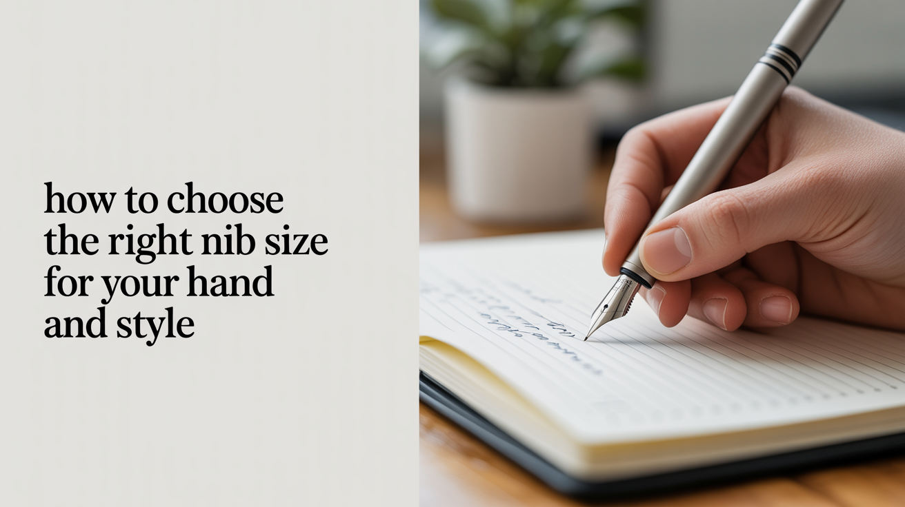
Stand in front of a nib display, or scroll a supply shop's website, and you'll hit a wall of letters and numbers that mean nothing yet: EF, F, M, B, or a string of brand names like Nikko G and Zebra G that all just look like "the pointed one." Figuring out how to choose nib size feels like it should be simple, but nobody hands you the decoder ring. Nib sizing actually follows a few plain rules once you know what each number is measuring, and your hand has more say in the answer than any chart does.
This guide covers how width changes your letters, how broad-edge and pointed pen sizing are really two different systems wearing the same letter codes, and why the "beginner" nib in pointed pen calligraphy is often the stiffest one in the drawer, not the softest.
How Nib Width Changes Your Letters
A broad-edge nib (the flat, chisel-tipped kind used for Italic, Foundational, or Gothic scripts) has a fixed edge width. That width sets your x-height directly, because most broad-edge hands are built on a ratio of nib widths stacked to make the body of the letter. A wider nib produces bigger letters and a heavier, bolder texture. A narrower nib gives you smaller, tighter letters with a more delicate feel. Neither is "better." A B (broad) nib fills an envelope flap fast and reads well from across a room; an EF (extra fine) nib suits a journal page held six inches from your face.
Width also controls contrast, the difference between your thick and thin strokes. A wider edge produces more dramatic swings between thick and thin at a given letter size, part of what makes Italic look expressive rather than flat. If a beginner's Italic sample looks strangely uniform, it's often a size mismatch: too narrow a nib for the target letter height flattens the contrast out.
Pointed pen nibs work on a different principle. There's no fixed edge width; the tines flex apart under pressure to create the thick strokes, then return to a hairline when you ease off. So "nib size" in pointed pen calligraphy isn't measuring line width the way broad-edge sizing does. It's closer to shorthand for flex, tine length, and how much pressure the nib rewards versus punishes.
Broad Edge vs. Pointed Pen: Two Sizing Systems, One Set of Letters
This is where a lot of the confusion starts. Broad-edge sizes (EF, F, M, B, and finer gradations some brands add between them) describe a physical edge width in millimeters, consistent within a brand's nib line. Pointed pen "sizes," on the other hand, are really just names: Nikko G, Zebra G, Tachikawa G, Hunt 101, Gillott 404. Each has its own flex profile, tine gap, and personality, with no shared numeric scale the way EF-to-B works for broad edge.
If you're coming from a broad-edge background and shopping for a pointed pen nib, drop the assumption that "F" or "EF" translates over. A pointed nib described as fine is talking about the hairline width it produces at rest, not a broad-edge-style size class.
How Your Hand and Grip Change What Feels Controllable
Nib choice isn't only about the letters you want on paper. It's also about what your hand can manage while you're still building control.
Hand size and finger length. A larger hand with longer fingers usually has more natural leverage over a broader nib, because the extra reach makes it easier to keep the edge angle consistent through a full stroke. Smaller hands often find a mid-size nib easier to rotate and control, especially for detailed letterforms where the pen pivots through tight curves.
Grip pressure. This matters more than most beginners expect, especially in pointed pen work. If your natural grip runs heavy (common for anyone coming from ballpoint or gel pens, where pressing hard is the only way to get ink moving), a nib with very responsive, easy-flexing tines will feel unpredictable. Every twitch of extra pressure turns into an unwanted thick stroke. A stiffer nib absorbs some of that heavy-handedness and gives you a narrower range between "too light to show contrast" and "too heavy to control," exactly the buffer a beginner needs.
Wrist and arm position. Writers who use more arm movement and less finger-driven pressure (a habit worth building early, covered in how much pressure to use in pointed pen calligraphy) tend to adapt to a wider range of nibs, since the pressure swings become smoother at the source.
Why Beginner-Friendly Pointed Nibs Are Usually Stiffer, Not Softer
It sounds backward at first. Wouldn't a beginner want the gentlest, most flexible nib to make thick strokes easy? In practice, the opposite holds up better.
A very flexible nib separates its tines with only light pressure, so small, involuntary variations in your hand (the ones every beginner has before muscle memory kicks in) show up immediately as wobbly, inconsistent thick strokes. A stiffer nib, like the widely recommended Nikko G or Tachikawa G, requires deliberate, sustained pressure to flex open. That threshold filters out accidental pressure changes and only responds when you mean it. The tradeoff is less dramatic thick-to-thin contrast than a very flexible nib can produce, but for a beginner, consistency matters more than drama. Graduate to a softer, more expressive nib (a Brause Rose or a vintage Gillott, say) once your pressure control is reliable and you actually want more range.
The pen holder matters alongside the nib itself, too. A nib that feels stiff and controllable in one holder can feel different in another depending on the angle it sits at, one reason it's worth reading straight vs. oblique pen holders: which to choose before assuming a "bad" nib is really the problem.
Nib Sizes at a Glance
| Nib Type | Category | Typical Use | Practice or Finished Work |
|---|---|---|---|
| EF (Extra Fine) | Broad edge | Small journaling, fine detail lettering | Both, but unforgiving for early practice |
| F (Fine) | Broad edge | Everyday Italic or Foundational hand, notes | Good for practice once basics are solid |
| M (Medium) | Broad edge | Standard practice size, most beginner worksheets | Practice |
| B (Broad) | Broad edge | Envelopes, posters, bold display lettering | Finished work, large-scale pieces |
| Nikko G | Pointed pen | Copperplate and Spencerian practice | Practice (very common first nib) |
| Zebra G | Pointed pen | Similar stiffness to Nikko G, slightly different feel | Practice |
| Tachikawa G | Pointed pen | Stiff, controllable, close cousin to Nikko G | Practice |
| Hunt 101 | Pointed pen | Small, flexible, popular for fine addressing | Finished work once pressure control is solid |
| Gillott 404 / 303 | Pointed pen | More flex, more dramatic contrast | Finished work, intermediate and beyond |
Treat this as a starting map, not a rulebook. Batch variation is common even between nibs of the same name, and humidity, ink, and paper all shift how a nib behaves.
When to Size Up or Down as Your Skill Grows
Early on, it's worth practicing with one broad-edge size and one pointed nib until they stop feeling foreign. Switching sizes constantly while you're still learning basic strokes just resets your muscle memory each time.
Signs you've outgrown a broad-edge size: your letters feel cramped at the current width, or you want more contrast than a narrower nib can deliver at a comfortable letter height. That's a cue to size up, not push harder for drama that width alone should be creating.
Signs you're ready for a more flexible pointed nib: your pressure control is consistent enough to produce a hairline upstroke and a clean downstroke without thinking hard about it, and the stiffer beginner nib is now capping the contrast you can get even with confident pressure. That's when a softer, springier nib pays off rather than just adding wobble.
Sizing down happens less often, but it's an option. Moving into smaller-scale work such as addressing envelopes or a compact journal, a smaller broad-edge width or a fine pointed nib like a Hunt 101 can suit the scale better than the nib you learned on. If you haven't gone through the mechanics of getting a nib properly seated, see how to assemble a dip pen and insert a nib, since a poorly seated nib can mimic the exact wobble that sizing questions get blamed for.
For a broader rundown of nib shapes and terms beyond sizing, calligraphy nibs explained: a beginner's guide is a useful companion to this one.
Frequently Asked Questions
What is the best nib size for an absolute beginner?
For broad edge, a Medium width is a common starting point: big enough to see your strokes clearly, not so wide that basic letterforms feel unmanageable. For pointed pen, a Nikko G or Tachikawa G is the most frequently recommended first nib, because its stiffness makes pressure control easier to learn.
Does a bigger nib mean better calligraphy?
No. Bigger nibs suit bolder work like envelopes or posters; smaller nibs suit fine detail and compact writing. Size should match the project and your current control, not a sense that larger is more advanced.
Why does my pointed pen nib feel scratchy or uneven no matter the size?
This is usually about nib preparation and pressure, not size. New nibs often carry a light manufacturing coating that resists ink until removed, and inconsistent pressure can make even a well-chosen nib feel unpredictable. Try another nib of the same type before assuming the size is wrong.
How do I know if a nib is too stiff or too soft for my hand?
Too stiff means pressing harder than feels natural just to get any thick stroke, which tires your hand fast. Too soft means the slightest touch produces an oversized thick stroke you didn't intend. The right nib sits in between, where your normal, relaxed pressure produces the contrast you're aiming for.