Projects
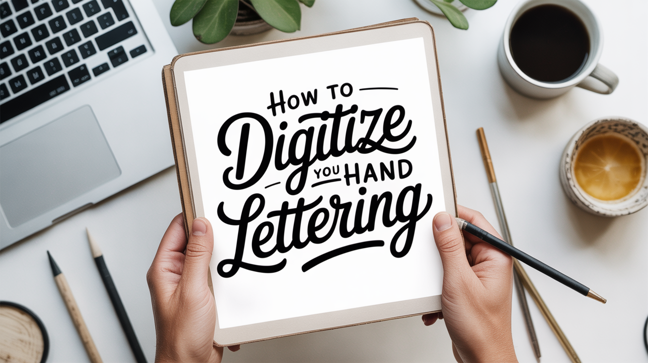
How to Digitize Your Hand Lettering
Learn how to digitize hand lettering step by step: scan, clean up contrast, vectorize, and export files you can use anywhere.
You wrote something beautiful by hand. Now you want to use it on a card, a print, or a digital file you can resize without it going blurry. The good news: getting hand lettering off paper and into a computer is a repeatable process, and none of the individual steps are complicated once you know the order.
This guide walks through the whole workflow from inking your piece through exporting a finished file.
Step 1: Letter on the Right Paper and Ink
The cleaner your original, the less work every step after it requires.
Ink: Use a waterproof, pigment-based black ink. Water-based inks can look fine on paper but scan with uneven gray tones that create extra cleanup. Soot-based India ink or pigmented calligraphy inks tend to produce a crisp, solid black.
Paper: Smooth, white paper gives you the most contrast. Textured or cream-tinted paper photographs and scans with more variation in the background, which you will have to remove later. Standard laser printer paper or smooth bristol both work well.
Spacing: Leave a generous margin around your lettering. When you scan or photograph, the software needs some clear background to identify where the letters end.
Let the ink dry completely before moving on. Even fast-drying inks benefit from a few extra minutes before scanning.
Step 2: Scan or Photograph Your Work
Scanning is the more consistent option. A flatbed scanner with optical resolution of at least 600 DPI (dots per inch) gives you enough detail for vectorizing later. DPI refers to how many individual dots of information the scanner captures in each inch of the image. Higher DPI means more detail but also a larger file. For hand lettering, 600 DPI is a reliable default; go up to 1200 DPI if your letters are very small or fine.
Place your paper flat, keep the lid closed, and scan in grayscale or black-and-white mode.
Photography works when you do not have a scanner. The key is flat, even lighting. Direct sunlight from one side creates shadows along thick strokes that look dramatic in person but complicate cleanup on screen. Indirect natural light or two lamps placed at equal angles on either side of your paper minimize shadowing. Shoot directly overhead, as parallel to the paper as you can manage, and use the highest resolution your phone or camera allows.
Step 3: Clean Up in a Raster Editor
A raster image (also called a bitmap) is made up of individual pixels, the tiny colored squares that form a photograph or scan. At this stage, your lettering is a raster file, typically a JPEG or PNG.
Open the file in any raster editing software. Free browser-based editors, photo editing apps on your phone, and desktop programs like GIMP all work for this step. You are looking for two controls:
- Levels or Brightness/Contrast: Drag the black point up until the ink is a solid, consistent black with no gray patches. Drag the white point down until the background is clean white with no cream or yellow cast.
- Threshold: Some programs offer a threshold slider that converts everything above a certain brightness to pure white and everything below it to pure black. This can save time if your scan is already fairly clean.
Zoom in and check for stray marks, dust specks, or paper grain. Erase anything you do not want appearing in the final file. The goal is a high-contrast black-and-white image where the letters are fully solid and the background is completely clean.
Save a copy of this cleaned raster file before moving on. It is useful to keep as a backup.
Step 4: Vectorize Your Lettering
This is the step most beginners find mysterious, but the core idea is simple.
A vector image is not made of pixels. It is made of mathematical paths that describe shapes. Because the shapes are mathematical rather than pixel-based, a vector can be scaled to any size without losing sharpness. That is why logos and lettering files used for printing are almost always vectors.
Vectorizing (also called image tracing) means software analyzes your black-and-white raster image and draws vector paths around the edges of each letter shape.
Most vector drawing programs include an automatic image trace feature. You open your cleaned raster file, run the trace, and the software produces a set of paths. The controls you will encounter:
- Threshold or blackness: Determines which pixels are treated as ink and which as background.
- Paths/corners: Controls how closely the paths follow the edges and how smooth the curves are.
- Noise: Ignores tiny specks below a certain size so they are not turned into paths.
Start with the default settings, expand the result into editable paths, and zoom in to evaluate the output. If curves look jagged or the letters have extra bumps, try increasing smoothing. If the trace is missing thin strokes, lower the threshold slightly.
This is also where the quality of your original pays off. A clean, high-contrast scan traces more accurately than a gray, textured one.
Step 5: Refine the Paths
After the trace, you will have vector paths representing your letters. Now you clean them up manually.
Zoom in close to each letter and look for:
- Extra anchor points (small squares on the path) that create wobbles in otherwise smooth curves. Delete the unnecessary ones.
- Gaps between strokes that should connect. Drag nearby points together to close them.
- Rough edges on corners that should be smooth or sharp. Adjust the curve handles attached to each anchor point.
This step takes patience, but you do not need to be perfect. The goal is to remove obvious problems, not to achieve machine precision. Hand lettering has natural variation, and that variation is part of what makes it interesting.
If you want the letters to remain as a single closed shape (for use as a cut file or a silhouette), check that each letter is a fully closed path with no open endpoints.
Step 6: Export the Right File Format
The format you need depends on how you plan to use the file.
| Use case | Format to export |
|---|---|
| Printing at large sizes | SVG or PDF (vector) |
| Cutting machines | SVG |
| Web use | SVG or PNG |
| Sharing with a designer | AI or EPS |
| Social media or digital cards | PNG at 300 DPI minimum |
SVG (Scalable Vector Graphics) is the most versatile format for most hobbyist uses. It can be opened in vector software, used directly on websites, and accepted by most cutting machines. If you only plan to use your lettering at one specific size and never need to resize it, a high-resolution PNG works fine and is easier for most people to work with.
When you export, check that the artboard or canvas is set to fit tightly around your lettering rather than leaving large empty areas. Most programs have a "fit to artwork" or "trim" option.
Raster vs. Vector at a Glance
If the difference between raster and vector is still fuzzy, this comparison covers the practical points:
| Raster (PNG, JPG) | Vector (SVG, PDF) | |
|---|---|---|
| Made of | Pixels | Mathematical paths |
| Resize behavior | Gets blurry at large sizes | Stays sharp at any size |
| Best for | Web images, photos | Logos, lettering, cut files |
| File size | Larger | Often smaller |
| Easy to edit | Colors and tones | Shapes and paths |
Most digitizing workflows produce both: you keep the raster file as an archival copy and use the vector for actual production work.
Frequently Asked Questions
Do I need expensive software to digitize my lettering?
No. Free and low-cost tools exist for every step of this process. For raster editing, GIMP is a full-featured free desktop program, and several browser-based editors handle basic levels and threshold adjustments. For vectorizing, Inkscape is a free, capable desktop vector program with a built-in trace function. Paid software often has faster or more refined tools, but the core workflow is the same.
My scan looks gray instead of black. What went wrong?
This usually means the scan settings were on color or grayscale mode with no threshold applied, or the ink was not fully dry. Try rescanning in black-and-white mode if your scanner offers it, or open the grayscale scan and apply a threshold adjustment in a raster editor to force everything to pure black or pure white.
How do I digitize calligraphy with lots of hairlines and thin strokes?
Thin strokes require high DPI and very clean ink. Scan at 600 to 1200 DPI, make sure the hairlines are solid (no gaps or skips from a dry nib), and increase the brightness of your scan before tracing so the thin strokes register as fully black rather than gray. During the trace, lower the noise threshold so small details are not discarded.
Can I use my phone instead of a scanner?
Yes, with some extra care. The main challenge is even lighting and keeping the phone parallel to the paper. Apps designed for document scanning use computational corrections to reduce shadows and warp, which helps a lot. After scanning, run the same levels/contrast cleanup you would on a flatbed scan before tracing.
What size should my lettering be for the best trace?
Larger letters trace more accurately because there are more pixels representing each stroke edge. If you are working small, consider scanning at a higher DPI or redoing the piece at a larger scale for the purpose of digitizing. Once it is a vector, you can scale it back down without any loss.
Once your lettering is a clean vector file, it opens up a range of projects. You can use it for hand-lettered greeting cards for beginners, print it at any size for a framed quote, or use it as a template for how to letter a quote layout and composition. If you want to apply your digitized letters to address work, see how to address envelopes in calligraphy for layout tips that translate well to both paper and digital files.