Projects
How to Make Calligraphy Place Cards
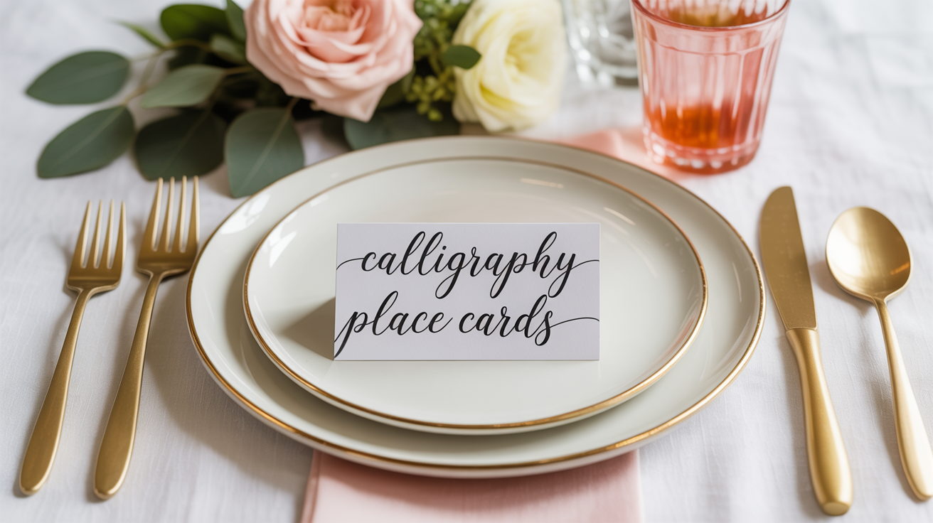
A beginner's guide to making calligraphy place cards for weddings and events, with supply lists, step-by-step instructions, and tips for clean results.
Calligraphy place cards are one of the most satisfying beginner projects: the cards are small, the names are short, and the result looks impressive on a table without requiring hours of practice. This guide walks you through choosing your materials, setting up your workspace, and lettering clean name cards that will hold up from the kitchen table to a wedding reception.
What You Need to Make Place Cards
Start with the right supplies and the project stays manageable. Here is a practical starting list.
Card blanks
Pre-cut card blanks save the most time. Look for tent-fold cards (they stand on their own) or flat cards that will sit in holders. A 90 lb (245 gsm) or heavier cardstock gives ink a smooth surface and resists bleeding. Matte white or cream works with any ink color. Avoid glossy finishes, as ink beads up on coated paper and takes much longer to dry.
Lettering tools
You have two main paths:
- Brush pen: A brush pen like the Tombow Fudenosuke (fine tip) or a Pentel Sign Pen is the gentler entry point. You do not need a separate ink bottle, there is no nib to clean, and modern scripts look natural with brush lettering. Good for beginners who have not yet tried dip pens.
- Pointed nib and dip pen: A beginner-friendly nib such as the Nikko G or Speedball C-6 paired with a basic straight holder gives a traditional calligraphy feel. You will need a separate ink or gouache.
Ink
For dip pens, sumi ink or a walite-based ink (such as Dr. Ph. Martin's Bleedproof White thinned for color work) flows reliably. If you want colored lettering, gouache diluted to a heavy-cream consistency works well. Brush pens come pre-loaded, so no separate ink is needed.
Other supplies
- Pencil and ruler for light guidelines
- Kneaded eraser to remove pencil lines without scrubbing
- A small piece of scrap paper to test every ink load before touching the real card
- A dinner plate or tray to lay finished cards flat while they dry
How to Set Up Your Guidelines
Even experienced calligraphers use guidelines. On small place cards they are nearly invisible once erased, and they keep every name at the same height.
- Decide your x-height (the height of a lowercase letter like "a" or "n"). For most place cards, 6-8 mm works well.
- Lightly draw a baseline and a cap-height or x-height line in pencil across each blank card.
- If you plan to add a small flourish below the name, add a descender line below the baseline too.
- Mark the center of the card with a tiny pencil tick so you can center the name visually.
Guidelines do not need to be perfectly measured every time. Once you have made five or six cards you will develop a feel for consistent spacing.
Lettering the Names: Step by Step
Work through the cards in batches. Trying to letter all 80 wedding place cards in one long sitting leads to fatigue and inconsistency.
- Write the name on scrap paper first. This shows you where long names will need tighter spacing and where short names will need more flourish to fill the card nicely.
- Load your pen or brush pen. For a dip pen, dip just past the vent hole, then wipe the excess on the rim of the bottle. For a brush pen, make two or three test strokes on scrap paper until the flow is even.
- Start with the first downstroke of the first letter. Slow, controlled pressure on downstrokes and light pressure on upstrokes is the core technique for pointed pen scripts. Brush pens follow the same logic: press for thick, lift for thin.
- Letter the full name without stopping between letters. Lifting between every letter tends to create inconsistent joins. Keep a steady rhythm.
- Set the card on the drying tray immediately. Do not stack cards until the ink is fully dry, which can take 2-5 minutes depending on ink and humidity.
- Erase pencil lines only after the ink is fully dry. Erasing wet ink smears and lifts the surface of the paper.
- Check the card at arm's length. Small wobbles are not visible from normal table-viewing distance.
If a name goes badly wrong, do not try to correct it on the card. Set that card aside and start a new one. Keep a small stack of extras from the beginning.
Handling Long Names and Short Names
Name card calligraphy is less forgiving than a quote layout because you cannot change the text. A few adjustments help.
Long names: Reduce the x-height slightly or tighten letter spacing. You can also split the first and last name onto two lines, with the first name in a lighter or smaller script above the last name.
Very short names (three or four letters): Add a small flourish on the first or last letter, or use wider letter spacing. A swash capital at the start of a short name fills the card without looking cluttered.
Matching heights across cards: Write all cards with the same name length in one pass. Then write medium names, then long names. This keeps your hand calibrated for each group.
For more on layout decisions when working with different name lengths and formats, see hand-lettered greeting cards for beginners, which covers similar centering and spacing challenges on smaller card formats.
Ink Color and Finishing Options
Black ink on white card is the clearest to read at a distance and the most forgiving to letter. But other combinations work well too.
- White or gold gouache on dark card (navy, black, deep green) looks striking for formal events and holidays. Gouache at the right consistency flows like ink but is fully opaque.
- Watercolor washes under the name add color without requiring calligraphy skill in two media. Apply the wash first, let it dry completely, then letter over it in black or dark ink.
- Metallic inks are beautiful but flow unpredictably. Test thoroughly before committing to a full set. Some metallic inks clog fine nibs quickly.
If you plan to address outer envelopes to match, the same tools and ink carry over directly. See how to address envelopes in calligraphy for the specific layout conventions for outer and inner envelopes.
Practice Strategy Before the Real Cards
Lettering 30 or 60 actual names on good cardstock is not the moment to practice a script for the first time. A simple warm-up plan:
- Spend one session drilling the alphabet in your chosen script on practice paper.
- Write a list of the actual names from your guest list on practice paper until each one feels comfortable.
- Letter five cards on your real cardstock as a test batch. Check ink flow, drying time, and legibility.
- Then work through the full set.
If the event is a wedding, plan to finish the cards at least two days before they are needed. That gives time to redo any that crack, smear, or look out of place without a last-minute rush.
For quote layouts and multi-line compositions using similar lettering skills, how to letter a quote: layout and composition covers centering, hierarchy, and spacing in more depth.
Frequently Asked Questions
What is the easiest tool to use for beginner calligraphy place cards?
A fine-tip brush pen is the most forgiving starting point. The Tombow Fudenosuke hard tip gives good control for small lettering and does not require a separate ink bottle or nib cleaning. If you already own a dip pen and have practiced with it, the Nikko G nib is reliable for place card-sized work.
How do I stop the ink from bleeding on the card?
Ink bleeds when the paper is too porous or the ink is too thin. Use 90 lb or heavier cardstock with a matte surface. If bleeding happens with your chosen paper, try a slightly thicker ink consistency (let it sit uncovered for 5-10 minutes to thicken slightly) or switch to gouache, which bleeds less than fluid ink.
How many extra blank cards should I prepare?
A good rule is 10-15% extra for a small event (under 30 cards) and around 5-8% extra for larger sets. You will make a few mistakes and some cards may smear during the erasing step.
Can I use a regular calligraphy pen (cartridge pen) instead of a dip pen?
Yes. Cartridge pens such as the Pilot Parallel or a Lamy calligraphy pen are convenient because the ink is contained. They produce a broader, more italic-style stroke rather than the thin-and-thick variation of a pointed nib, but they work well for clean, readable place cards without the mess of an open ink bottle.
How long before the event should I make the place cards?
Make them no more than one to two weeks ahead. Cards stored longer may curl slightly or pick up dust. Store finished cards flat, face up, in a single layer or between sheets of tissue paper, in a dry room away from direct sunlight.