Projects
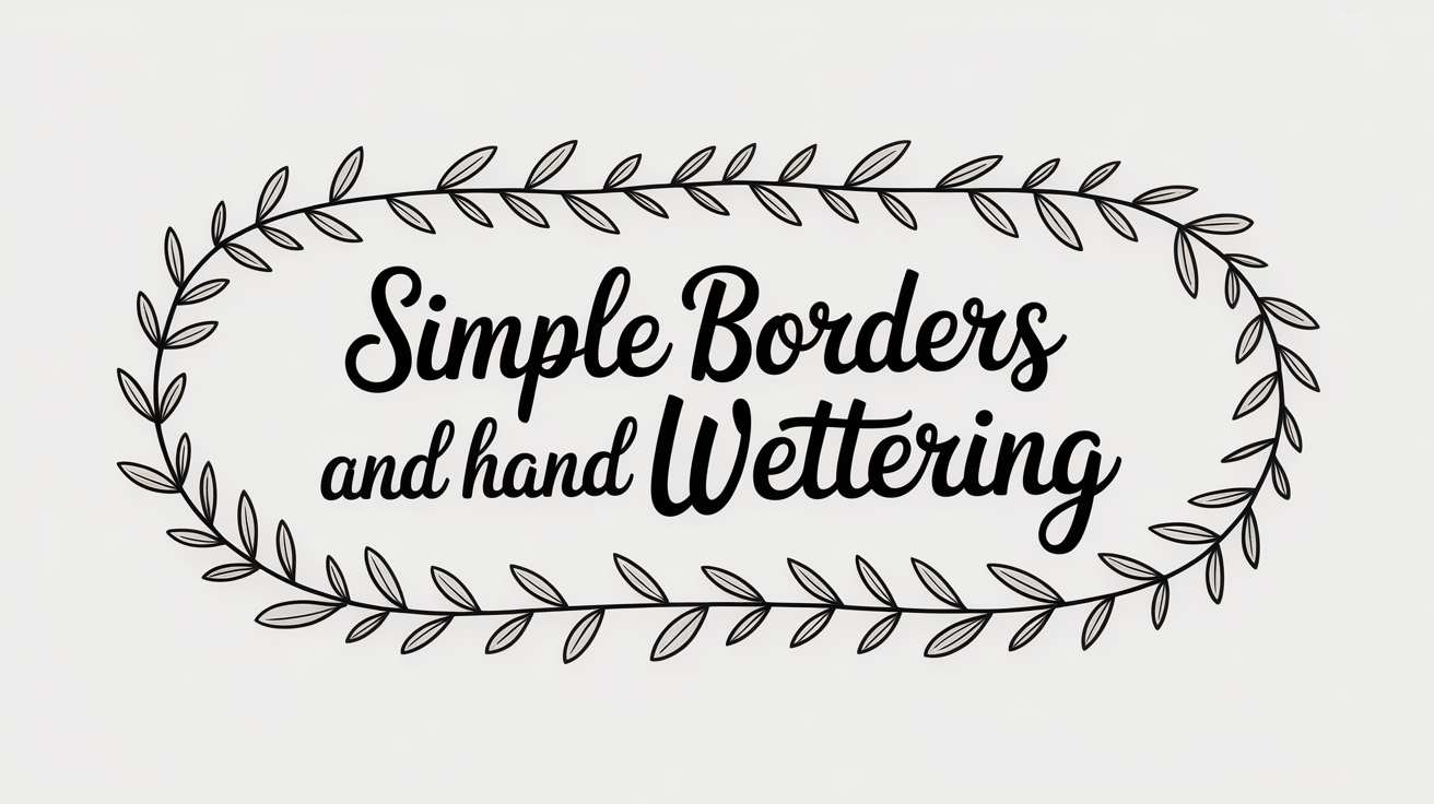
Simple Borders and Wreaths in Hand Lettering
Learn how to draw hand lettering borders and wreaths from scratch. Step-by-step guide to wreaths, leaf sprigs, and corner borders for beginners.
Borders and wreaths do one job well: they frame your lettering so the words feel intentional rather than floating on a blank page. You do not need artistic training to draw them. A wreath is a circle of repeated simple shapes, and a border is a line with repeated marks along it. Once you break each one down to its smallest unit, the repetition becomes the point.
This guide walks through both from scratch. You will start with a pencil guide circle and work outward, then move on to line and corner borders you can apply to cards, envelopes, and quote layouts.
Drawing a Wreath: The Guide Circle First
A wreath looks round because it starts with a round guideline, not because the artist has a steady freehand. Skipping this step is the main reason first wreaths go lopsided.
- Lightly trace a circle in pencil. A coin, lid, or compass all work. For a card-sized wreath, a diameter of about 7-8 cm is a comfortable size.
- Mark the top, bottom, left, and right points of the circle with small pencil ticks. These are your anchors.
- Decide on a gap. Most wreaths have an opening at the top or bottom where the lettering title sits, or are fully closed. Mark that gap now so you know where to stop your greenery.
- Add a second, slightly larger circle outside the first if you want a thicker wreath. The gap between the two circles tells you how much visual weight the greenery should fill.
- Begin drawing along the inner circle with a light touch. You are not tracing the circle itself; you are using it as a spine.
Once the guide is in place, the wreath almost draws itself.
Adding Leaves, Sprigs, and Branches
Leaves are the most forgiving motif (a motif is any small repeated decorative shape) in hand lettering. A beginner leaf is two short curved strokes that meet at a point. That is the whole shape. From there you build up.
Single leaf: Draw a short curved line to the right, then mirror it back to the starting point, meeting at a tip. Add a center vein line if you like.
Sprig: A sprig is a stem with leaves branching off it. Draw a slightly curved line, then add three to five leaves alternating left and right along it. Sprigs tile around a wreath guide circle naturally because they follow a curve.
Branch: A branch is a thicker main stem with smaller secondary stems, each ending in a leaf cluster or berry dot. Branches give a wreath a more botanical look.
Berry cluster: Three circles grouped together, with a tiny curved stem. Quick to draw and good for filling gaps between sprigs.
To tile around the guide circle, place a sprig at each anchor mark first (top, bottom, left, right). Then fill in between. Working in quarters like this prevents bunching. Rotate your paper as you go so your hand always works in a comfortable direction.
When you have filled the circle, erase the pencil guide. The slight irregularity in the finished wreath is what makes it look hand-drawn rather than printed.
Building Simple Line and Corner Borders
A line border is a straight or gently undulating line with a repeating mark along it. A corner border frames a rectangular space by placing a decorative element at each corner and connecting them with simpler lines.
Line border options:
- Dots spaced evenly along a pencil baseline (a baseline is the invisible line that letters sit on, here used as a guide for spacing)
- Short diagonal hatching marks alternating left and right
- Small leaf shapes repeated at regular intervals
- A wavy line with tiny circles at each crest
Corner border approach:
- Lightly pencil the rectangle you want to frame.
- Draw a corner motif at each corner first. A simple corner motif might be two short sprigs crossing at a 90-degree angle, or a small cluster of three leaves fanning outward.
- Connect the corners with a simpler line treatment along each side: a single rule, a double rule, or a dot-dash pattern.
- Erase the pencil rectangle.
The key to even borders is spacing. Mark equal intervals in pencil along each side before you draw any ink marks. Eyeballing rarely looks as clean as a ruler grid does, and the pencil lines erase cleanly once the ink is dry.
Motif Ideas to Add to Your Reference Sheet
A reference sheet (sometimes called a cheat sheet) is a page you fill over time with motifs you have practiced. When you start a new project, you pull from that page instead of inventing from scratch.
Here are motifs that pair well with lettering borders and wreaths:
- Small ferns: Three to five leaflets radiating from a central stem point, each leaflet slightly curved.
- Olive branch: A gently curved stem with small oval leaves and occasional berry pairs.
- Eucalyptus: Round leaves on a curving stem, often overlapping slightly.
- Wheat stalks: A thin stem with an oval seed head and a few trailing leaf blades.
- Simple flowers: Five circles arranged around a center dot, or a daisy drawn with eight short petals.
- Laurel leaves: Elongated oval leaves paired opposite each other on a stem, classic for a more formal wreath.
- Pinecone: A small oval made of overlapping scale marks, good for winter projects.
- Stars and asterisks: Six lines radiating from a center point; quick to repeat and easy to space evenly.
Practice each motif ten times on a scrap sheet before committing it to a project. Ten repetitions is usually enough for the shape to feel familiar in your hand.
Combining Borders and Wreaths with Your Lettering
A wreath works best when the lettering inside it is finished first. Write your phrase, leave it to dry fully, then build the wreath around it. This prevents you from discovering mid-wreath that your text is off-center.
For border projects like hand-lettered greeting cards for beginners, draw the border last as well. Complete the lettering, confirm it sits where you want it, then frame it.
For addressing envelopes in calligraphy, a simple two-line border top and bottom is enough to elevate the look without crowding the address lines. Keep the motifs small and the spacing generous.
When you move on to larger quote layouts, the composition decisions described in how to letter a quote layout and composition apply to your border framing as well. A border that is too thick overwhelms the lettering; one that is too thin disappears. A good rule of thumb is that the border should take up roughly 15-20 percent of the total visual space.
Frequently Asked Questions
My wreath comes out lumpy and uneven. Is that a problem?
No. Uneven first wreaths are the norm, not a sign of a mistake. The slight variation in leaf size and spacing is part of what makes hand lettering look handmade. With practice the shapes even out naturally. If a specific area looks too sparse or crowded, you can add a berry cluster or small filler leaf to balance it without redrawing the whole thing.
What pen or tool should I use to draw the wreath leaves?
A fine-tip felt pen or a micron-style liner in 0.3 or 0.5 mm gives clean leaves with consistent line weight. A brush pen also works and adds natural thick-thin variation if you vary pressure. Avoid very thick tips for fine leaf details; they obscure the shape. Experiment on scrap paper to find what feels comfortable for your hand.
How do I space the motifs evenly around a circle?
Mark the four anchor points (top, bottom, left, right) first and place a motif at each one before filling in. Dividing the circle into quarters first means any uneven spacing is isolated to one section rather than compounding all the way around. You can also count the number of motifs you want and mark their positions lightly in pencil before inking.
Can I mix different leaf types in one wreath?
Yes, and mixed wreaths often look more interesting than a single repeated shape. A common approach is to use one primary leaf type (such as a simple sprig) for the majority of the wreath and add one accent type (such as berries or a small flower) to break the rhythm every few repeats. Too many different shapes in one wreath can look busy; two or three types is usually enough.
Do borders need to be perfectly straight?
Not for most hand lettering projects. A very slightly wavy border often looks more natural than a mechanically perfect one. If you want a crisp straight line, use a ruler and pencil guide first. For a more relaxed greeting card or journal page, a freehand line with small motifs along it reads as intentional rather than imprecise.