Brush Lettering
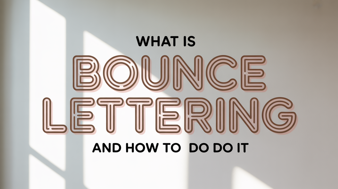
What Is Bounce Lettering and How to Do It
Bounce lettering breaks letters off the baseline for a playful, rhythmic look. Learn what it is, how to do it, and how to practice it as a beginner.
If you have scrolled through hand-lettering on social media and noticed how some words seem to bounce up and down like they have energy inside them, you have already seen bounce lettering. The letters do not sit obediently on a single line. Instead, they dip below it, pop above it, and create a loose, rhythmic feel that looks spontaneous even when it takes real practice to pull off. This guide explains exactly what bounce lettering is and walks you through how to start doing it yourself.
What Bounce Lettering Actually Is
Standard lettering sits on a baseline. The baseline is the invisible horizontal line that the bottoms of most letters rest on. In bounce lettering, individual letters shift up or down from that baseline on purpose. A letter might drop so its bottom sits lower than the others, or rise so its top clears the usual height. The effect reads as lively and casual rather than stiff or formal.
Bounce lettering is closely associated with modern brush lettering, the style that uses flexible brush pens to produce thick downstrokes and thin upstrokes. Traditional calligraphy scripts like Copperplate follow strict rules about letter placement. Bounce calligraphy loosens those rules, making it feel more expressive and approachable for beginners.
The key thing to understand is that bounce is controlled, not random. Successful bounce has a rhythm. Some letters go up, some go down, and the shifts feel intentional even if they look improvised.
The Core Concepts You Need to Know
Before you start moving letters around, a few terms will help you understand what you are adjusting.
Baseline: The line the bottoms of most capital and lowercase letters rest on.
X-height: The height of a lowercase letter with no ascender or descender. The letter "x" is the classic reference. In bounce lettering, the x-height of each letter can vary slightly.
Ascender: The part of a letter that rises above the x-height, like the tall stroke on a "b," "d," "h," or "l."
Descender: The part of a letter that drops below the baseline, like the tail on a "g," "p," "q," or "y."
In bounce lettering, you shift the whole letter body up or down relative to the baseline. The ascenders and descenders still extend in their usual directions from wherever the letter body lands.
How to Do Bounce Lettering: A Step-by-Step Approach
If you are new to brush pens, spend time on brush lettering for beginners and get comfortable with the basic letter shapes before adding bounce. Bounce is a variation on top of a foundation, not a shortcut around it.
Step 1: Draw your baseline. Use a pencil and ruler to draw a light horizontal line across your paper. This is your anchor even when you are ignoring it.
Step 2: Write a word normally first. Write the word you want to bounce in your usual brush lettering style, with every letter sitting on the baseline. This tells you how much horizontal space the word takes up and lets you see the shapes clearly.
Step 3: Identify which letters to shift. A simple starting pattern is to alternate: drop odd-numbered letters slightly below the baseline, keep even-numbered letters on or above it. You do not have to follow this mechanically, but it gives you a rhythm to start with.
Step 4: Shift letter bodies, not just exits. A common beginner mistake is only curving the exit stroke of a letter downward. That changes the stroke shape but does not create true bounce. To bounce a letter, move the entire body of it, including where it starts and where it sits.
Step 5: Keep your connecting strokes consistent. The small connecting strokes between letters need to travel up or down to meet the next letter wherever it lands. These transitions are where bounce lettering gets technically demanding. Practice them slowly.
Step 6: Erase your guidelines. Once the ink is dry, erase the pencil baseline. Without the line, the bounce looks intentional and fluid.
Step 7: Repeat with variations. Try different amounts of shift. A subtle bounce of just a few millimeters reads as elegant. An exaggerated bounce of half a letter height reads as playful. Neither is wrong; they are different moods.
Common Mistakes Beginners Make
Bouncing every letter equally. If every letter shifts up or down by the exact same amount, the result looks mechanical. Vary the shift amounts slightly to get a natural rhythm.
Skipping the pencil stage. Bounce lettering planned in pencil first will almost always look more controlled than bounce done freehand in ink from the start. There is no shortcut here when you are learning.
Letting the bounce collapse in short words. On a two-letter word, there is not much room for rhythm to develop. Bounce reads best on words of four letters or more. Short words can stay flat or use just a hint of shift.
Ignoring the basic strokes of brush lettering. Bounce amplifies whatever is already in your letterforms. If your downstrokes are uneven and your upstrokes are scratchy, bounce will make those issues more visible, not less. Drilling strokes before adding bounce gives you a cleaner result.
Choosing the Right Pen for Bounce Lettering
Bounce lettering is typically done with a brush pen, specifically one with a flexible nib that responds to pressure. Hard-tip felt pens can do a version of it, but the thick-thin contrast that makes bounce so readable comes from a flexible brush tip.
A medium-sized brush pen is usually easier for beginners than a very small or very large one. Small vs large brush pens covers this comparison in more detail, but in short: a smaller brush tip gives you more control over the placement of each letter, which matters a lot when you are learning to shift letters intentionally.
Smooth paper helps. Textured paper can catch the brush tip mid-stroke and interrupt the flow, which becomes more noticeable when you are trying to make controlled, deliberate shifts.
Building a Practice Routine
Pick one word and write it ten times using the alternating-shift pattern described above. Then write it ten more times with a different pattern, perhaps raising every third letter instead. After that, write it with the shifts exaggerated as much as you can manage.
This kind of deliberate variation builds control faster than writing many different words at the standard size. Shaky results are normal at this stage. The shifts will not be even, the connecting strokes will be inconsistent, and some letters will look like they do not belong in the same word. That is exactly where everyone starts.
Set the session's work aside and look at it again the next day. You will spot the patterns in what needs correction more easily with fresh eyes.
Frequently Asked Questions
Is bounce lettering the same as modern calligraphy? They overlap but are not identical. Modern calligraphy is a broad category that relaxes the rules of traditional scripts. Bounce lettering is a specific technique within modern calligraphy and brush lettering where letters shift off a shared baseline to create rhythm. You can do modern calligraphy without bounce, and bounce lettering without anything traditionally calligraphic about the letterforms.
Do I need grid paper or a slant guide for bounce lettering? A single pencil baseline is enough for most practice sessions. Grid paper can help you measure consistent shift amounts when you are first learning, but it is not required. Some letterers use dot-grid paper because the dots are easier to erase cleanly than solid lines.
How much should I shift each letter? Start with small shifts, roughly one-quarter to one-third of the x-height up or down. That amount is visible without making the word hard to read. Once that range feels natural, you can experiment with larger shifts.
Why does my bounce look choppy instead of fluid? Choppy bounce usually comes from one of two places: inconsistent pressure on the brush pen (which makes the strokes themselves look uneven) or abrupt connecting strokes between letters. Slow down the connections between letters and focus on making them smooth curves rather than sharp angles.
Can I do bounce lettering with a regular pen? Yes, though it looks different. Without the thick-thin contrast of a brush pen, the bounce movement is still visible but the result has a flatter, more uniform look. Faux calligraphy, where you draw the thick strokes on after writing, is one way to get thicker strokes with a regular pen if you want to experiment before investing in brush pens.